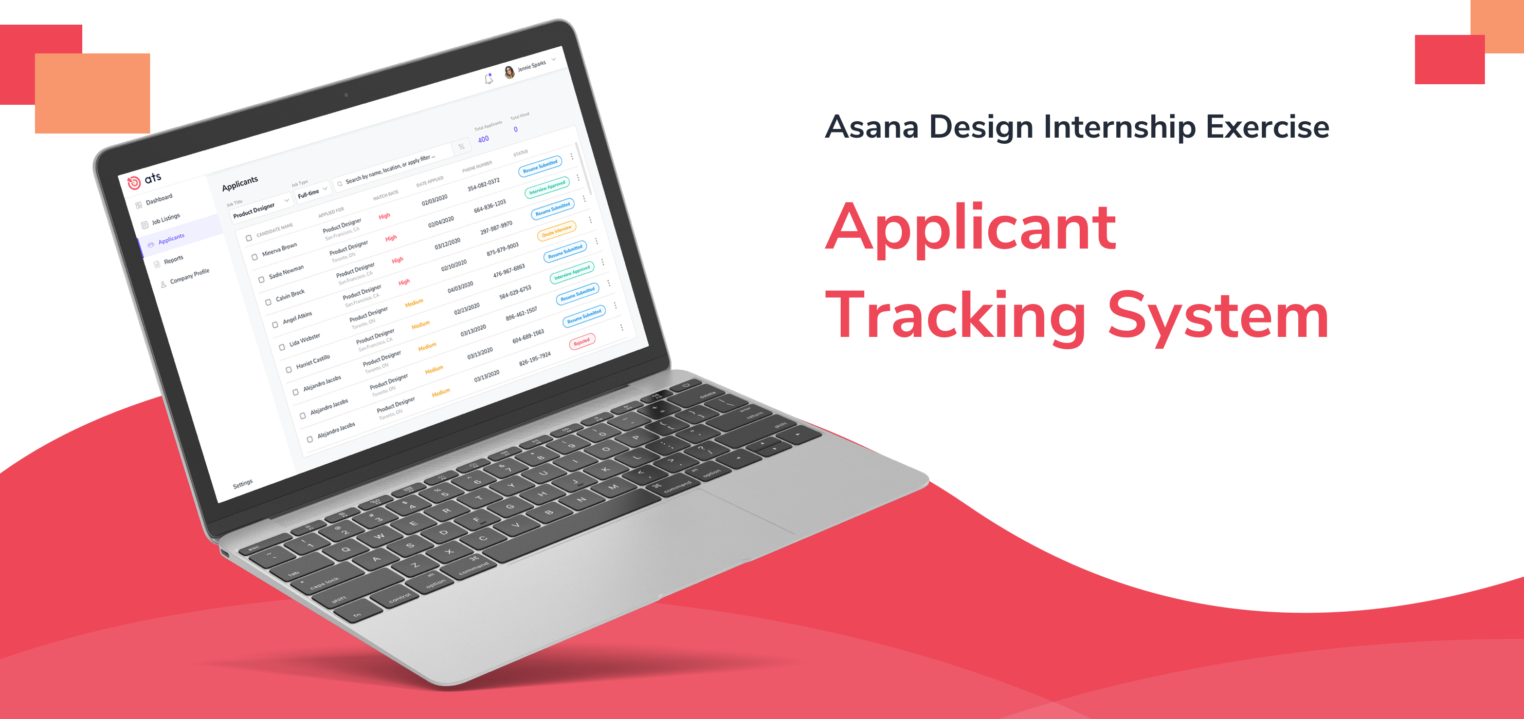

ATS is an applicant tracking system for Asana tailored to help the Recruiters, to manage the job candidate applications, and Interviewers, to manage interviews.
Type:
Design Challenge
Skills Applied:
Brainstorming, User Flow, Paper-prototyping, Wireframing, Hi-fed Prototyping
Platform:
Web
Software:
Figma, Sketch, Adobe Photoshop, Invision
Duration:
24 hours
Disclaimer: This is a 24 hour design challenge. I haven't done research or survey of any kind for this project. However, I have assumed that a group of my team members (UX researchers) have completed the upfront research and gathered the user needs and requirements.
Before getting into the user needs, let's cover a basic understanding of who our target users are. Given below are two of our users.
Recruiters are the primary users. They use the ATS to keep track of all the applicants, along with their details and recruiting stage.
Interviewers are the secondary users. They use ATS to get updated about the assigned candidates for conducting interviews and evaluating them.
Now, lets have a look at the needs of the Recruiters :
Automation in saving the details of the candidates. This includes their bio data, resume, cover letter, etc.
Recruiters should be able to find candidates easily.
They should be able to view and edit the current stage of the recruiting process easily.
They should be able to assign candidates to interviewers in few steps.
They should be able to view the evaluation details of candidates.
Now, lets have a look at the needs of the Interviewers :
Interviewers should be able to view their interviews easily.
They should be able to provide a time schedule to the recruiters.
They should be able to provide feedback about the candidate easily.
Now that we have understood the user needs, we will set a goal of our design project before moving ahead with the ideation phase.
I started by choosing the product / solution platform. To view a large number of candidates, with the most useful data being displayed in the frontface, using a table would be the best option. To view multiple canditates in a table while performing quick actions, the best platform would be the Web.
I started listing down the requirements using my tablet (procreate app) since it would be easier for me to scribble, erase, and edit.
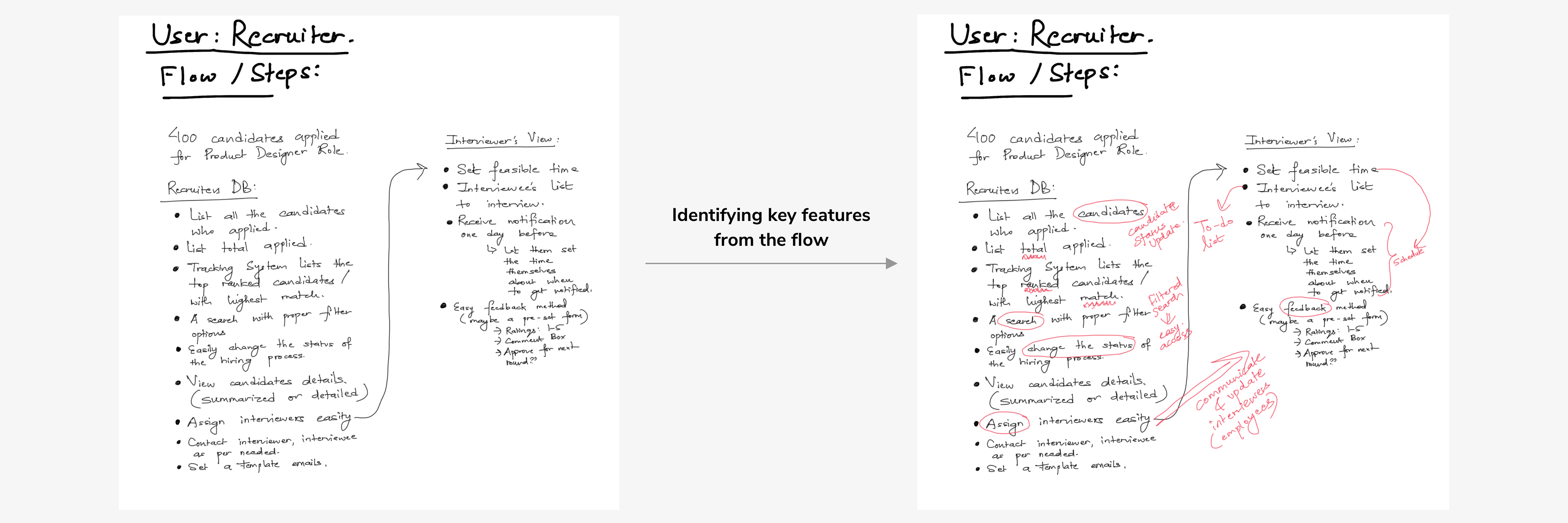
I created three user flows: ATS system flow for recruitment, Recruiter's Flow and Interviewer's Flow.
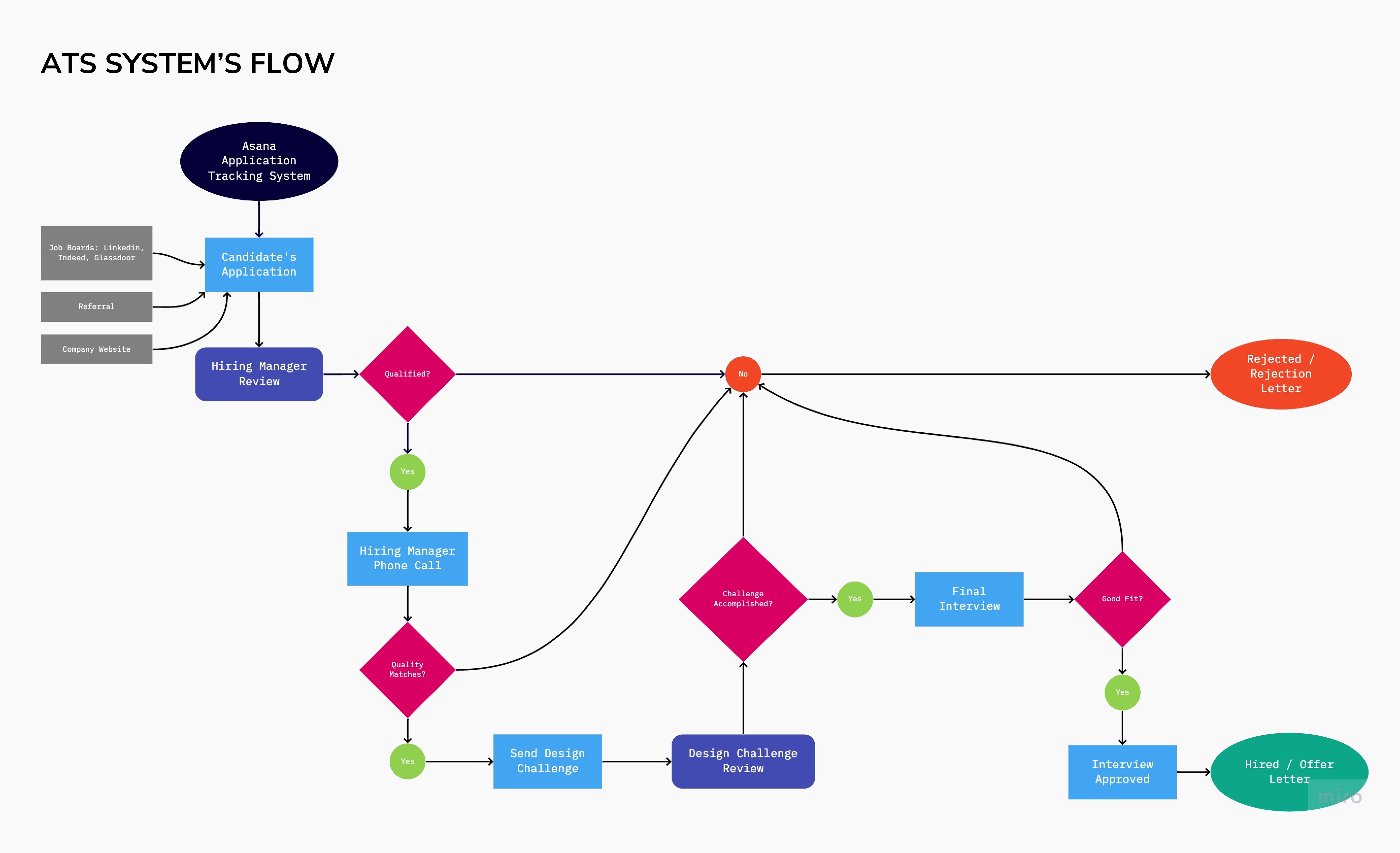
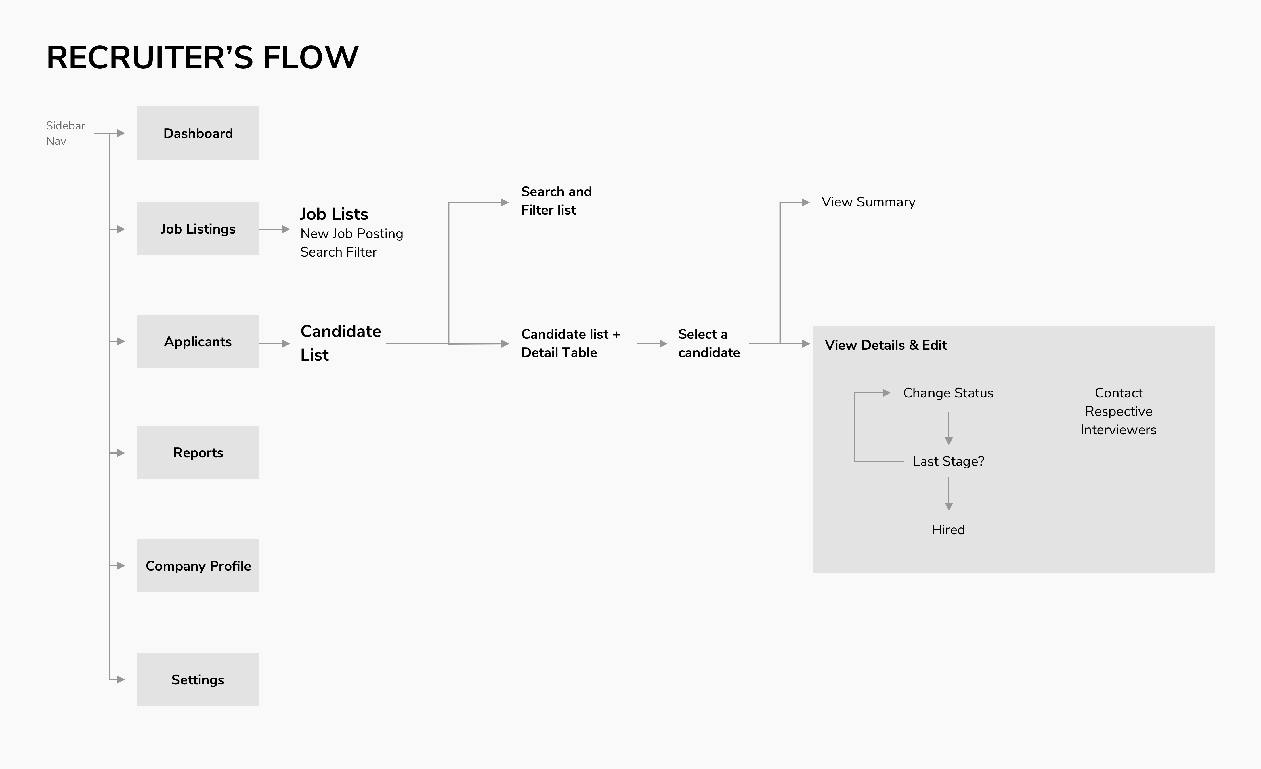
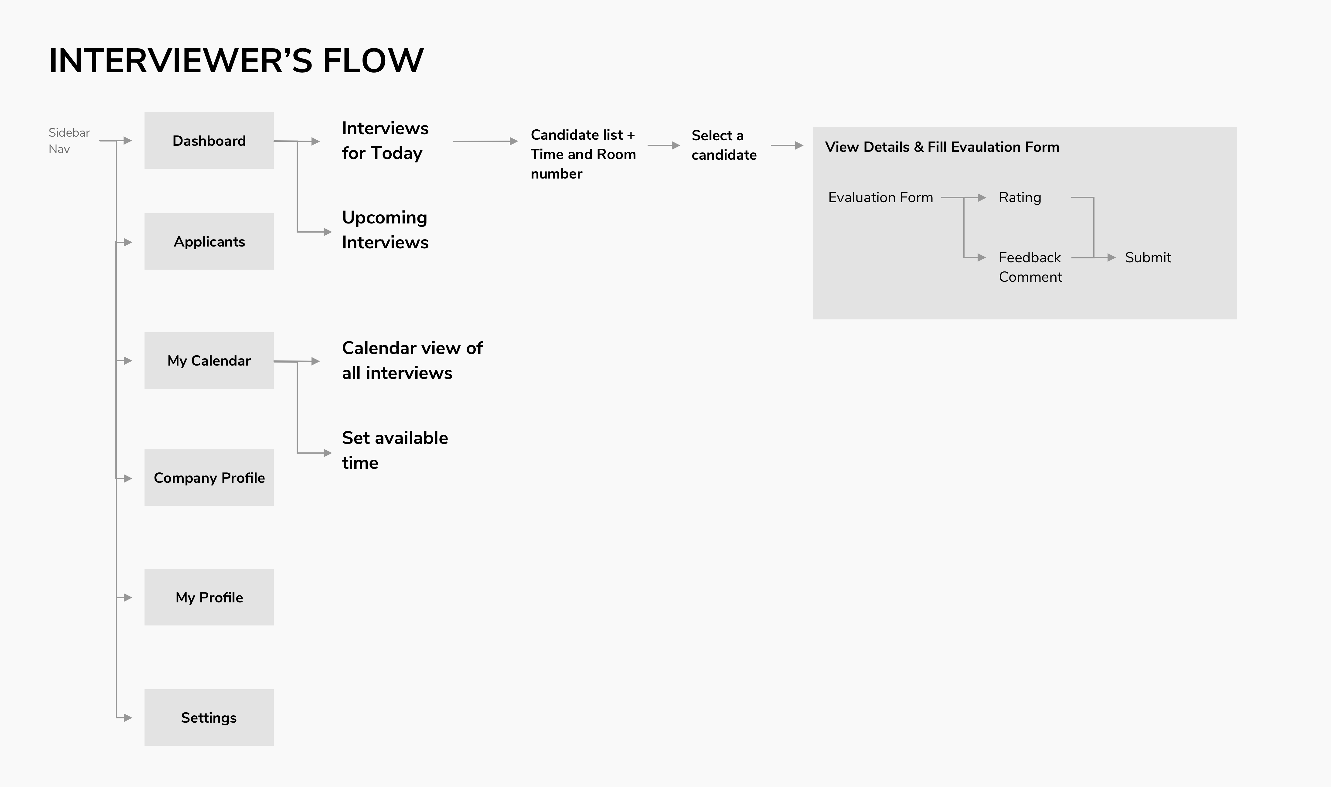
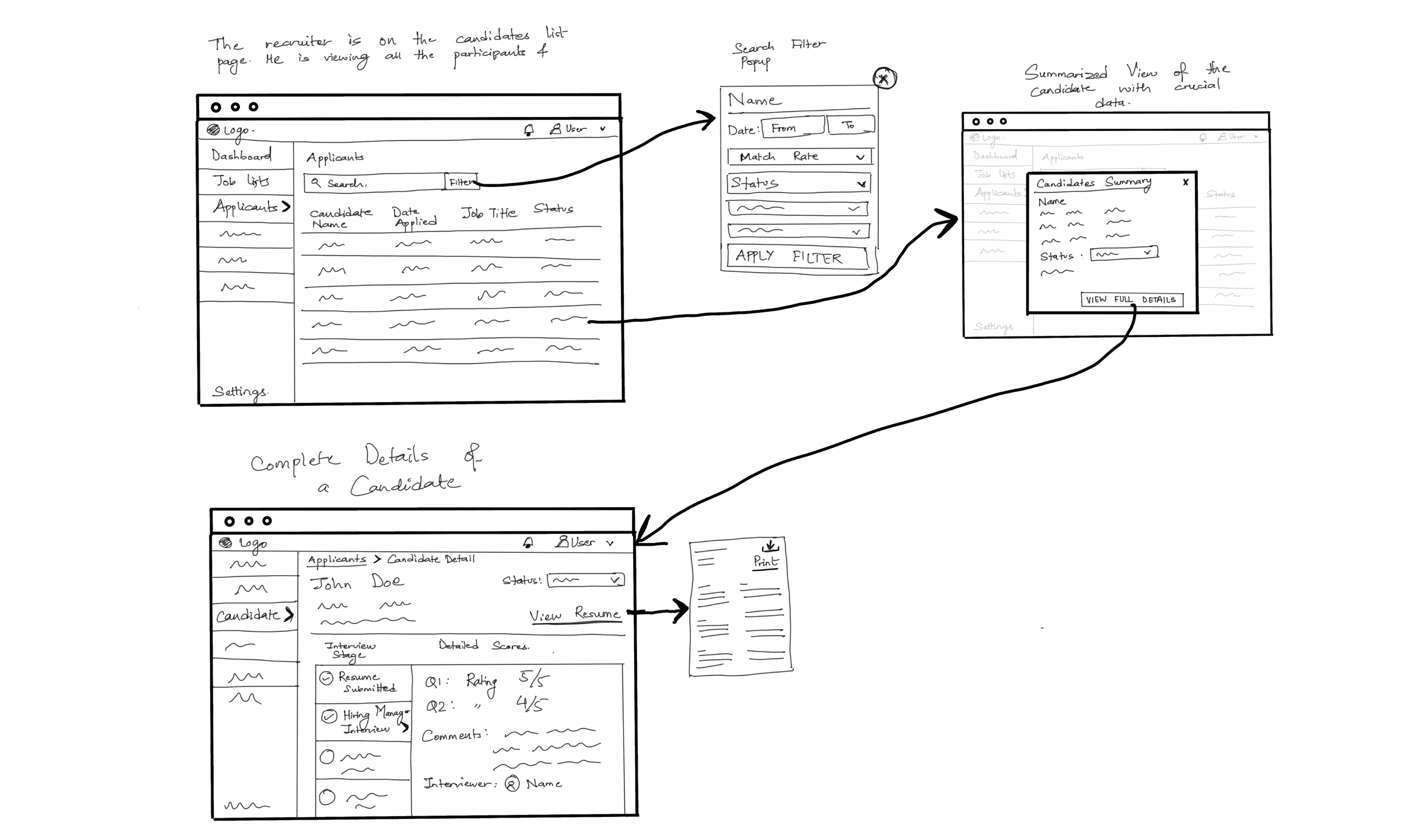
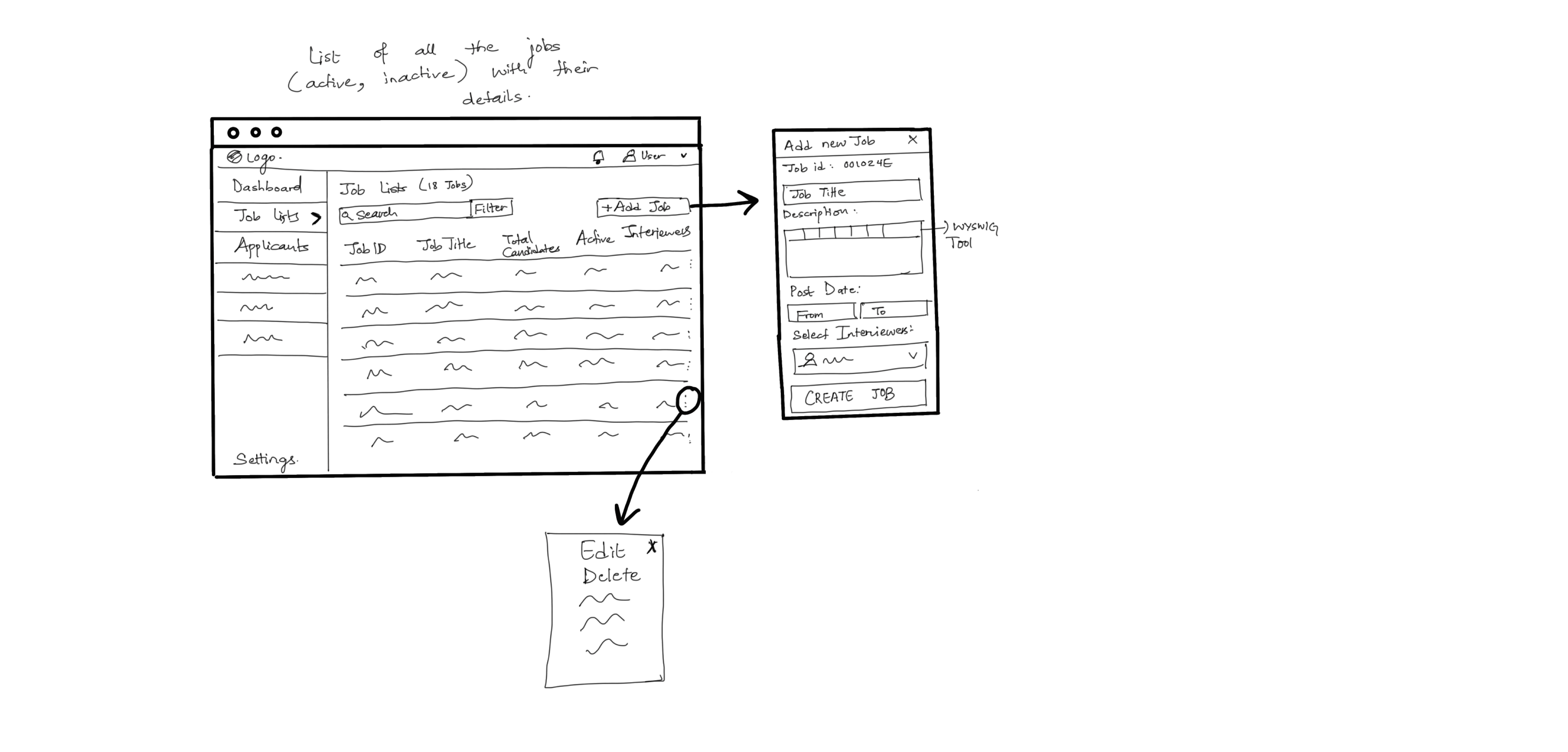
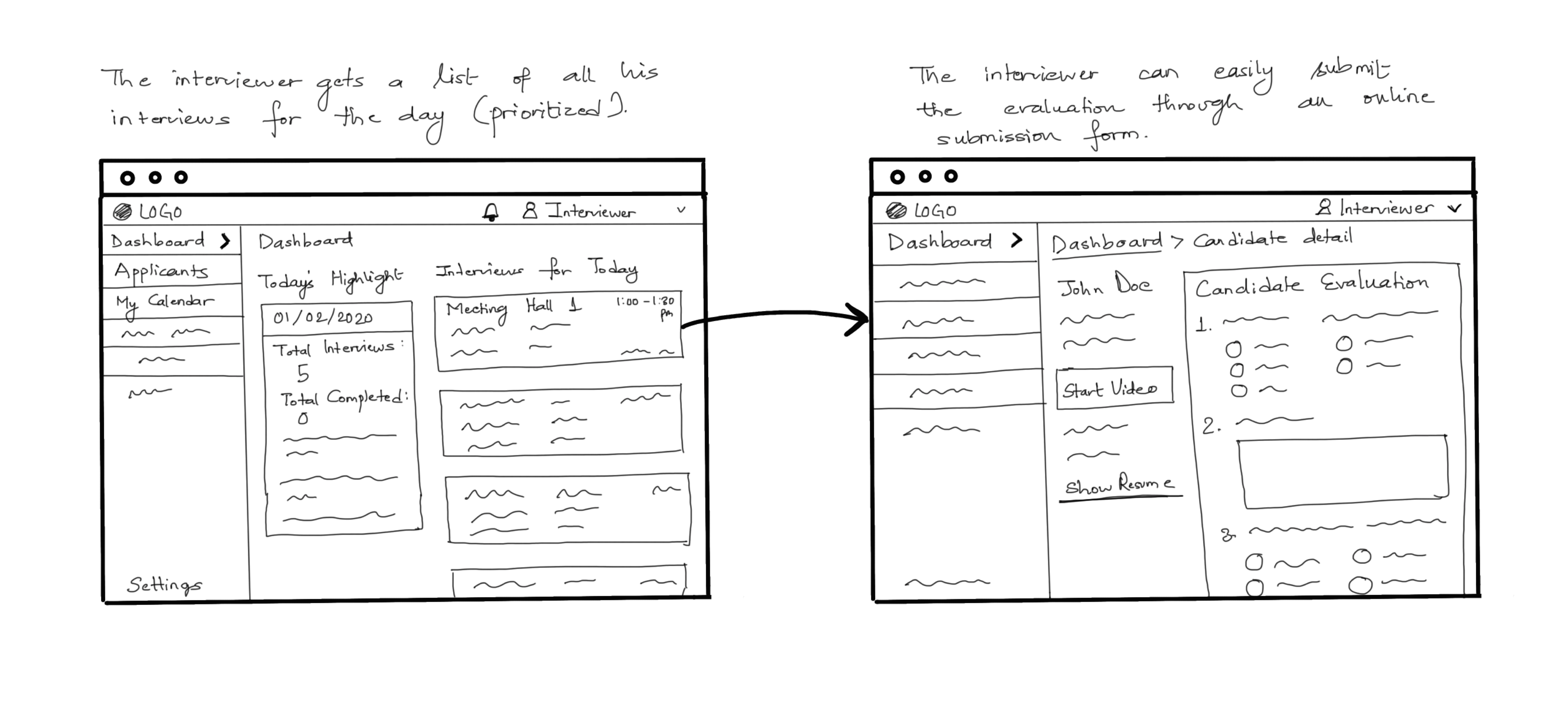
I focused on creating a flow, such that it provides automation to the recruiter, but also provides the flexibility to edit and change different elements. For example, the interviewers assigned to a candidate. I also focused on creating minimal steps for performing each task so that it save the time. For creating the wireframes, I used Figma.
Link to Interactive Wireframe for Recruiter
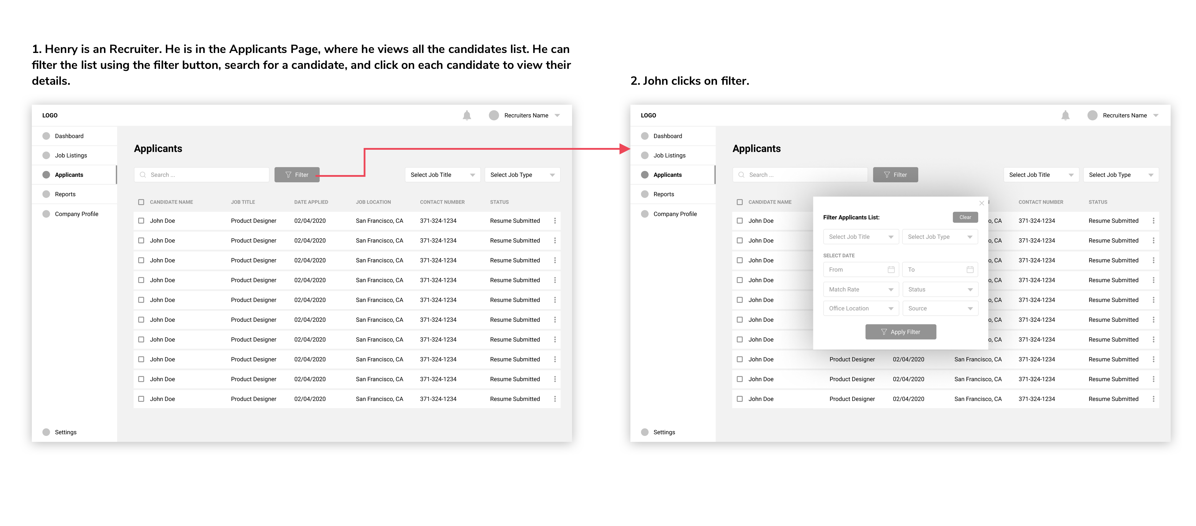
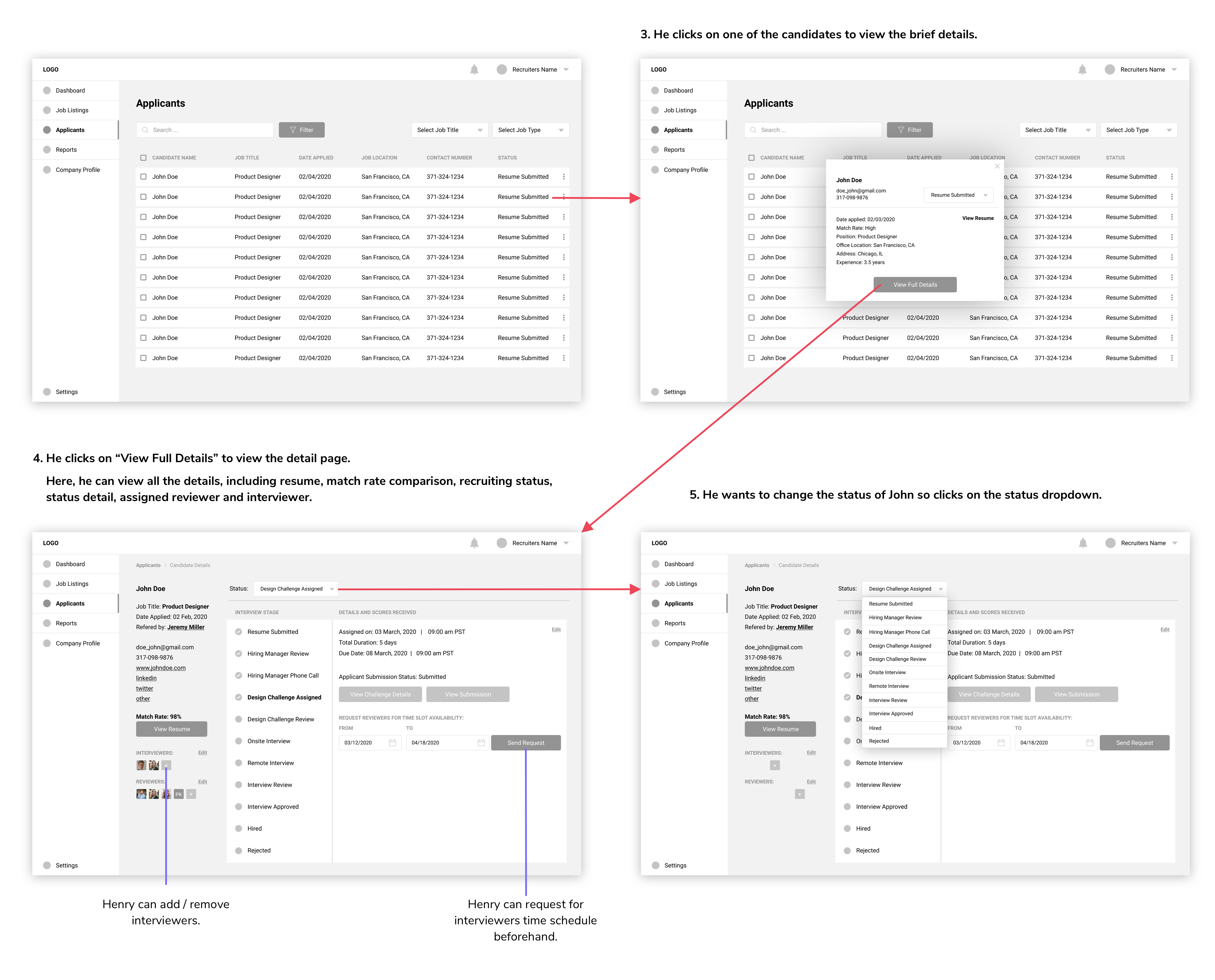
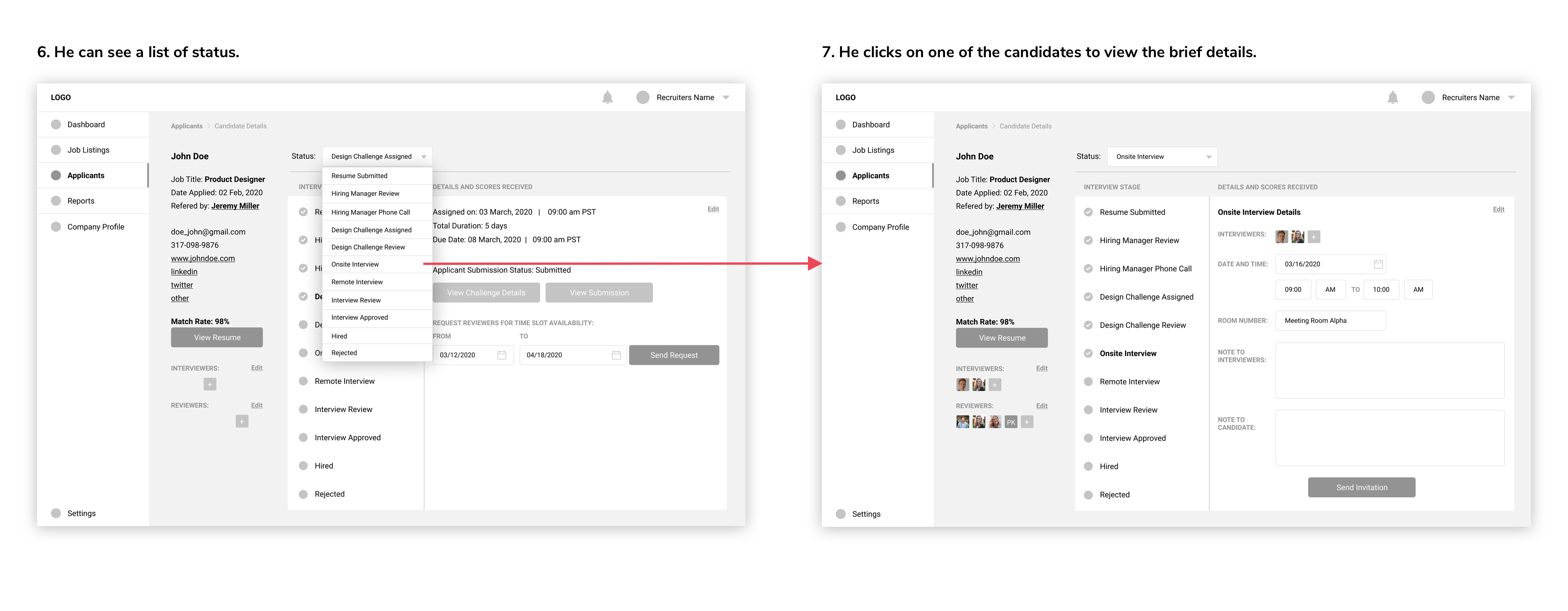
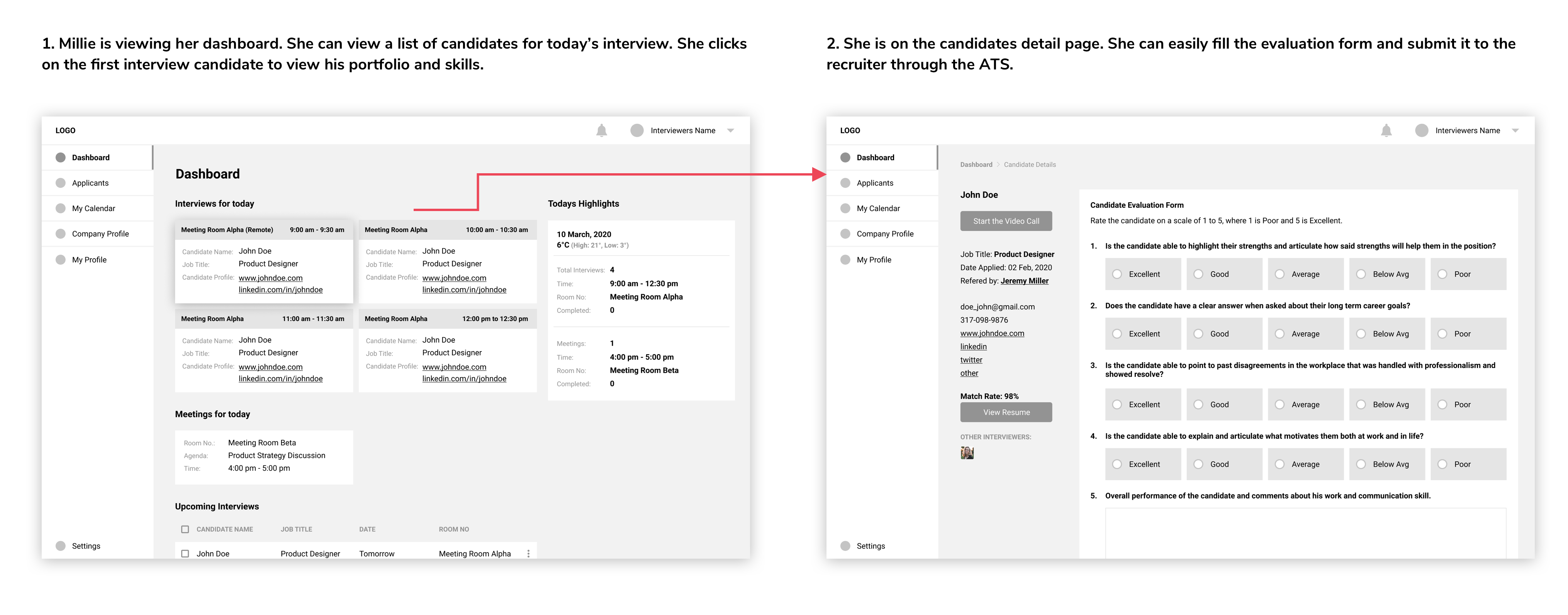
I used Asana Brand colors to maintain consistency. However, I could not use the same font since I did not have one.
Link to High Fidelity Screens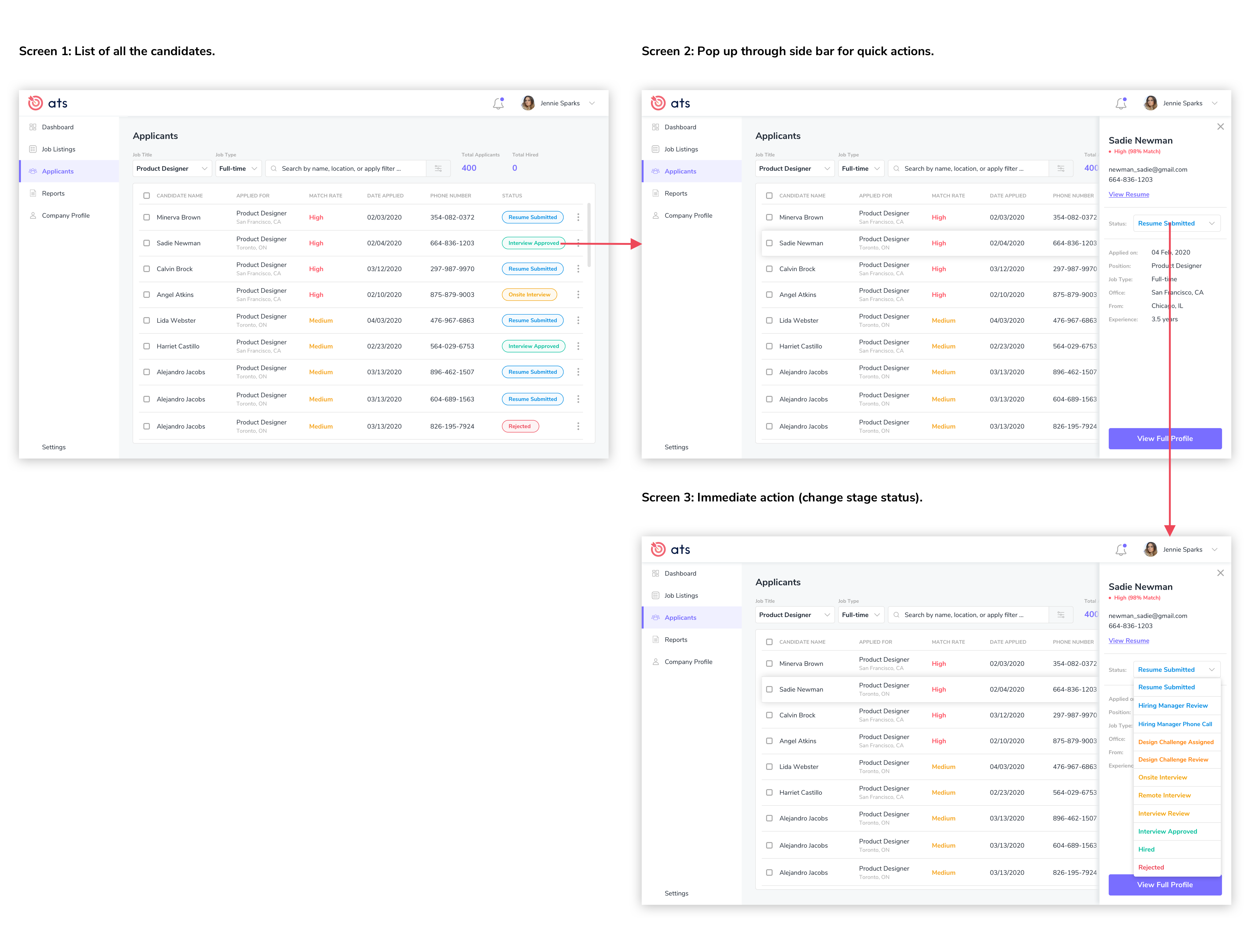
Time Constraint: The biggest challenge for me was to complete the entire task within 24 hours. In the past, I had made many mistakes due to the stress and lack of confidence. This time, I learned to stay calm and complete the task on time.
User Flow: Defining the user flow was challenging with the needs provided. I have never used a tracking system before. I separated two hours to research about the existing systems and to list down the process based on my experience (as a candidate).
Future Direction: I learned how to manage time without panicking. If I had more time, I would love to conduct 1-2 inperson interview and survey to gather data from real users. I would also conduct a think-aloud testing session using the wireframes before moving ahead with the high-fidelity design.