

Momentum Shift is a coaching program at Gymkhana Muay Thai, a physical fitness center, located in Nepal. In this project, we present a mobile application that helps the fitness trainers to add new trainers easily, plan their workout, and track their progress.
Total team members / Duration:
4 / 12 weeks
Tools Used:
Sketch (User Interface Design), Invision (Prototyping), Adobe Illustrator (Artworks and Icons)
My Role:
User Research, Product Strategy (Ideation, Defining Key Features), Interaction, Visual Design

Currently, the trainers at Momentum Shift manually manage individual trainee progress report. They use Google Doc to create a brief plan (one-month plan or three-months plan or quarterly or yearly plan). They use Google Sheet to track daily progress.

Difficult Customization
It is difficult for the trainers to find and edit daily data in the google sheet especially when the training program is for a more than a month.

More Time & Effort
GymKhana has more than 100 trainees in a day. Manual adding and editing takes a lot of time.

Hard to track records
To edit a record, trainers find it difficult to search the right document and place.
A mobile application for Fitness Trainers, working at Gymkhana Muaythai, for easy and effortless management of customer’s / trainee’s task, progress, and workout schedule.
Fitness Trainers can easily create a new Exercise, Worksheet (collection of exercise / usually a day plan), and a Program (collection of worksheet / usually a month plan or more).
The users can save, edit, and reuse the same plan for multiple people.
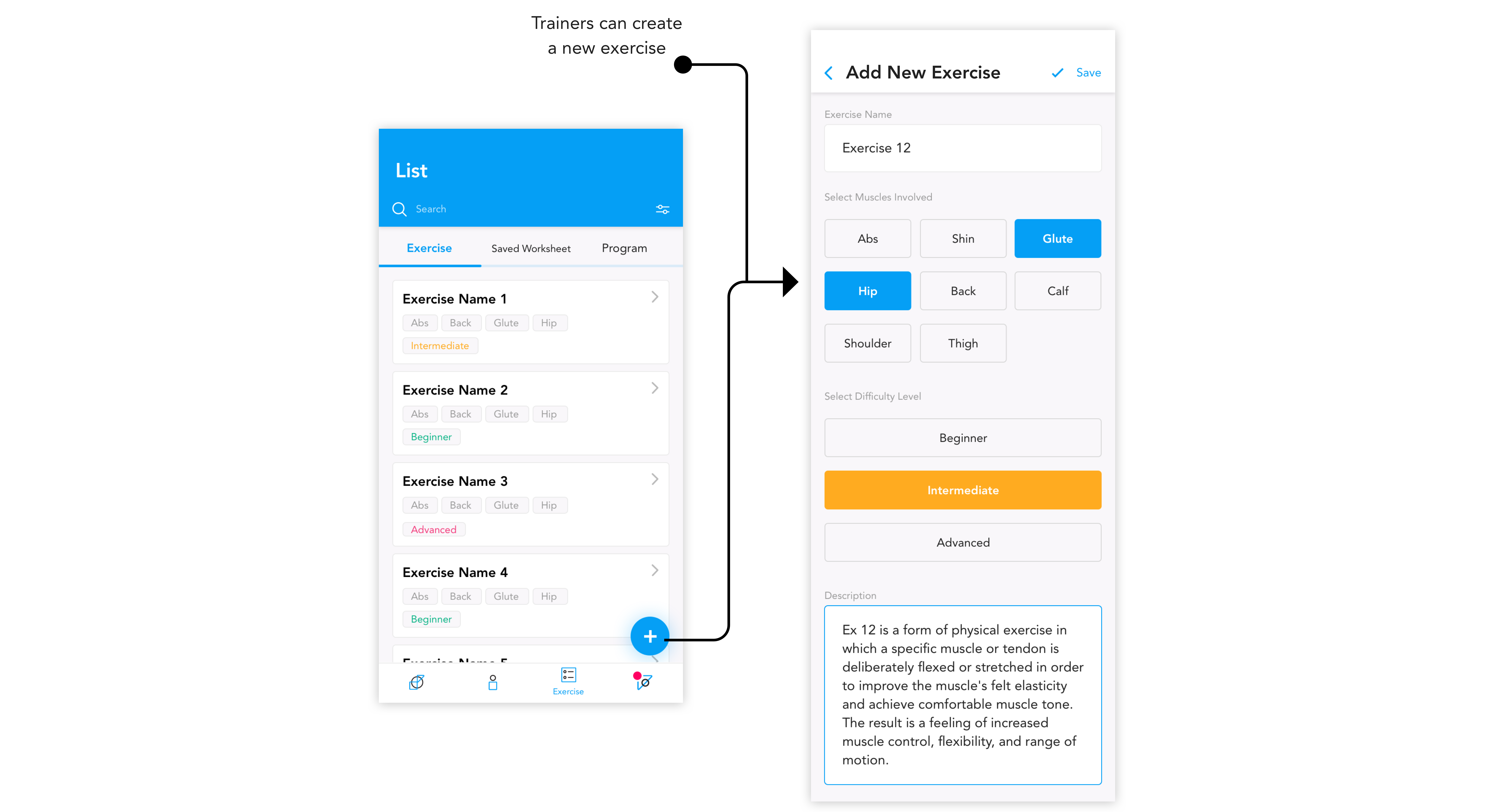
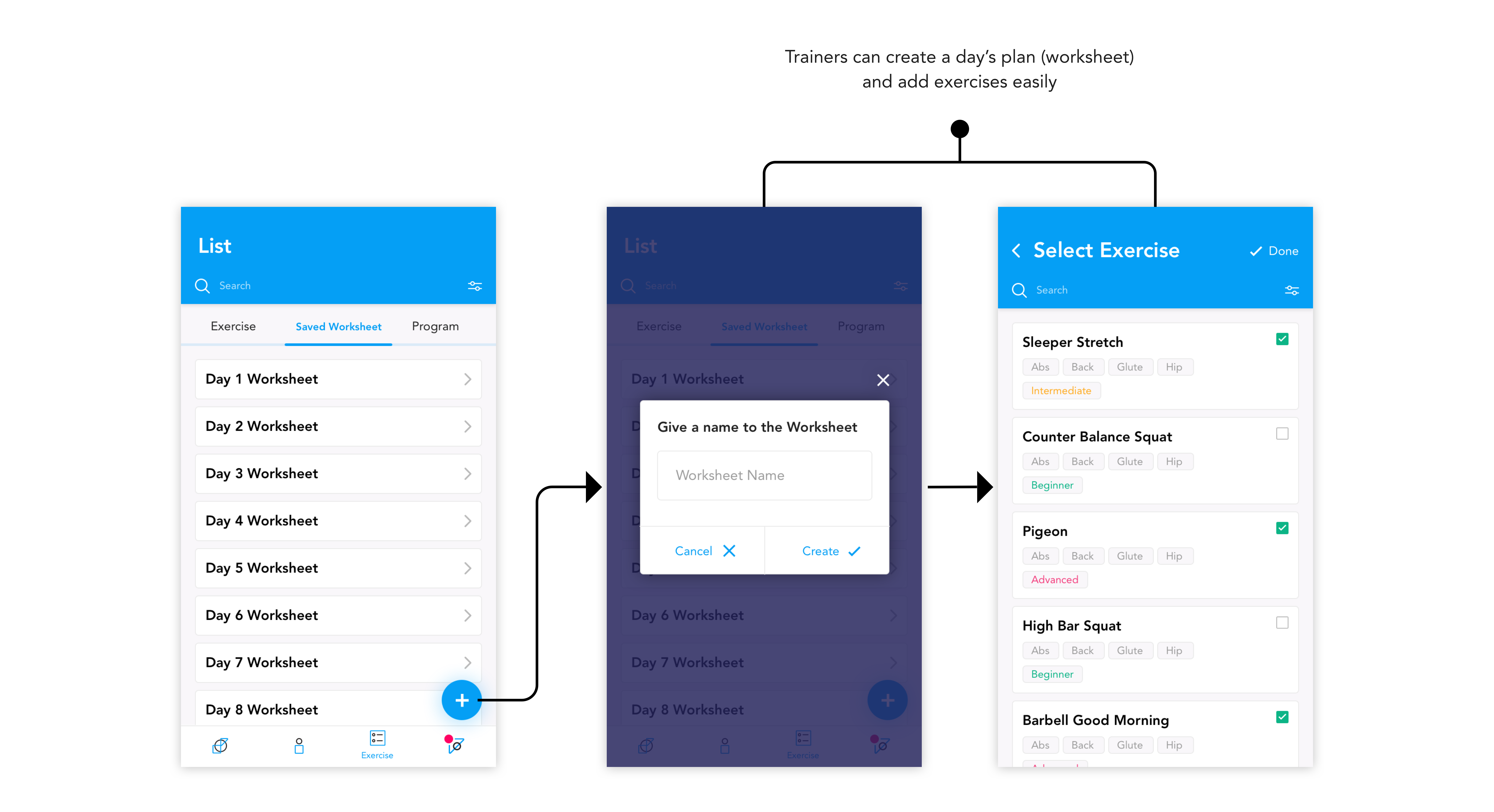
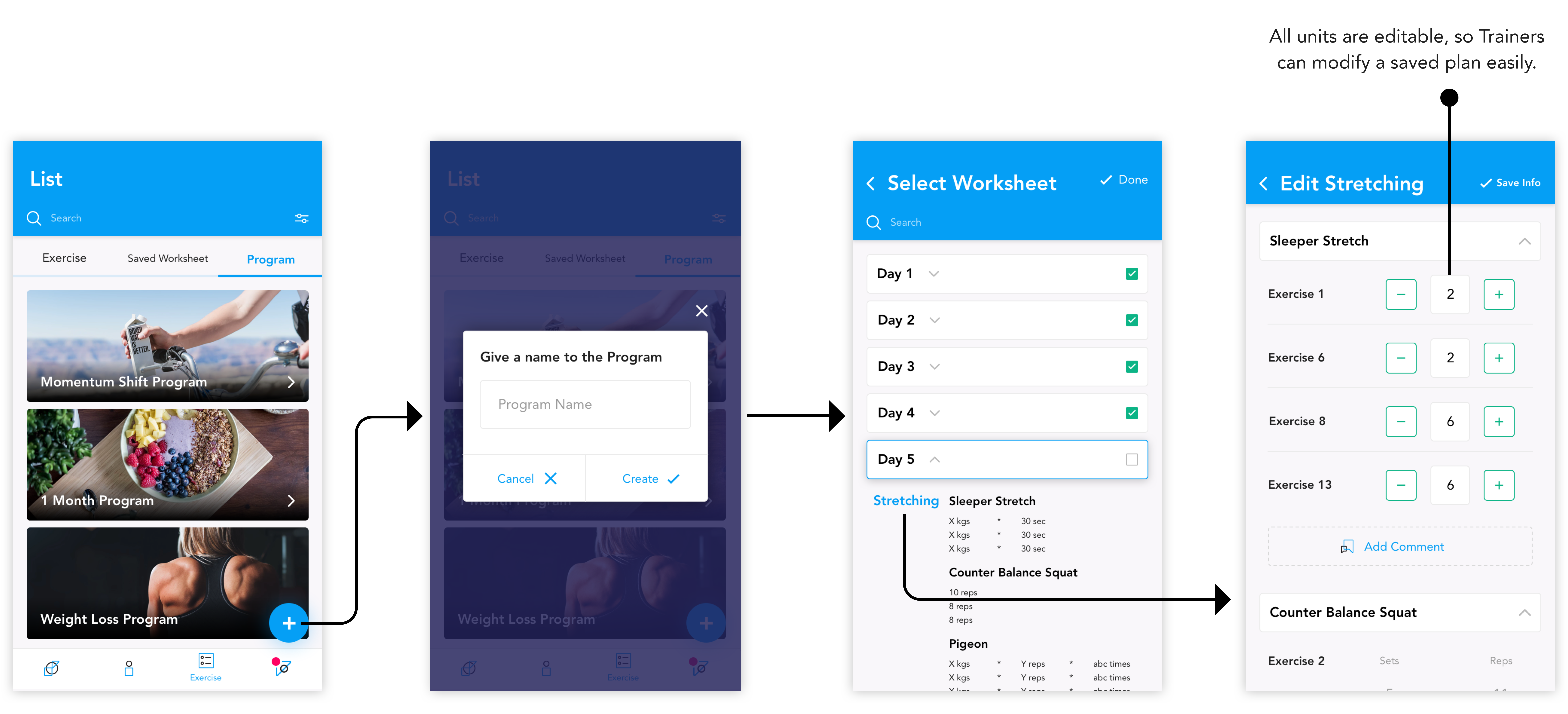
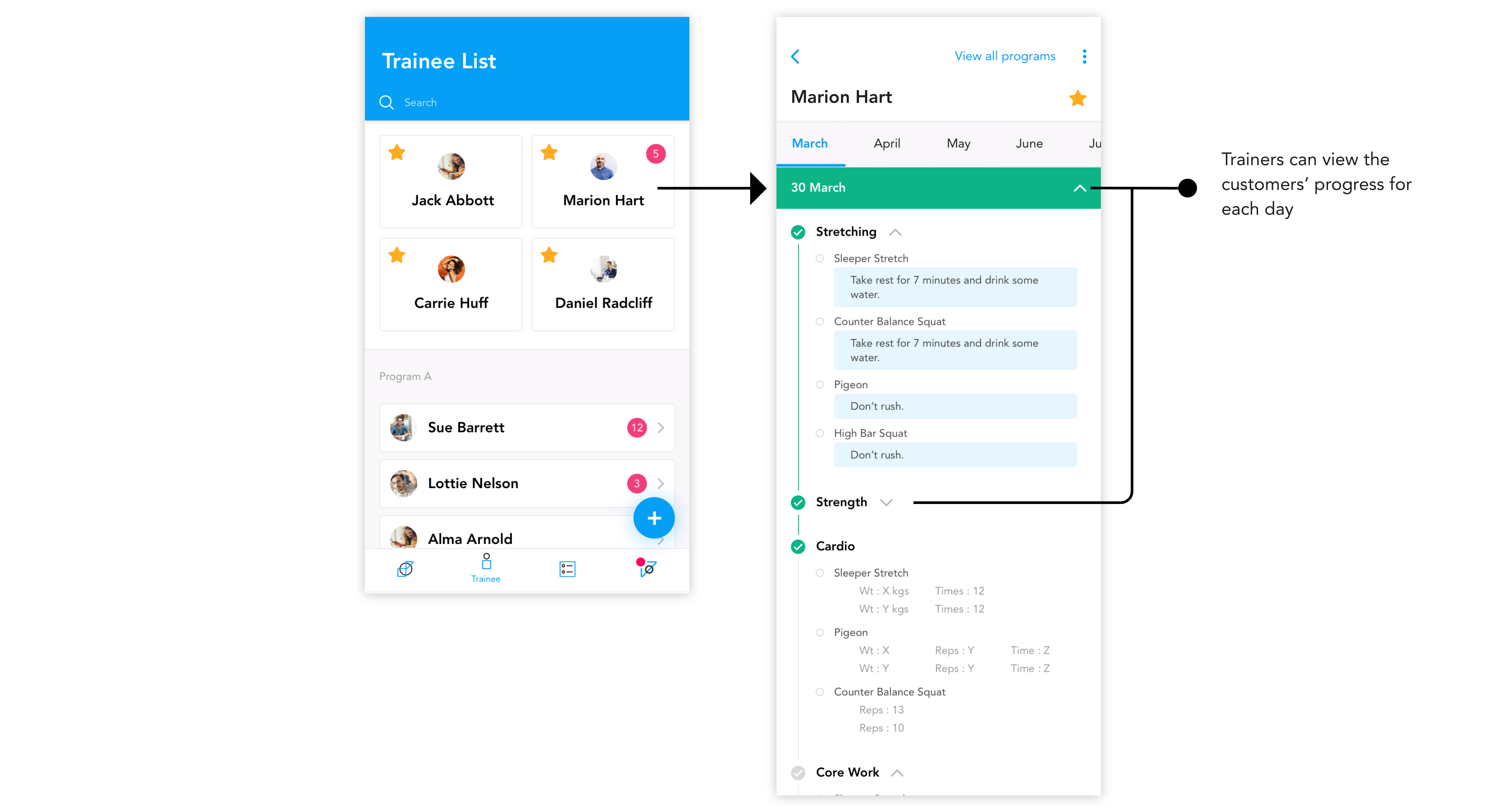
Trainers can star-mark their customers and view them according to the Program name. They can view their daily progress and comments.
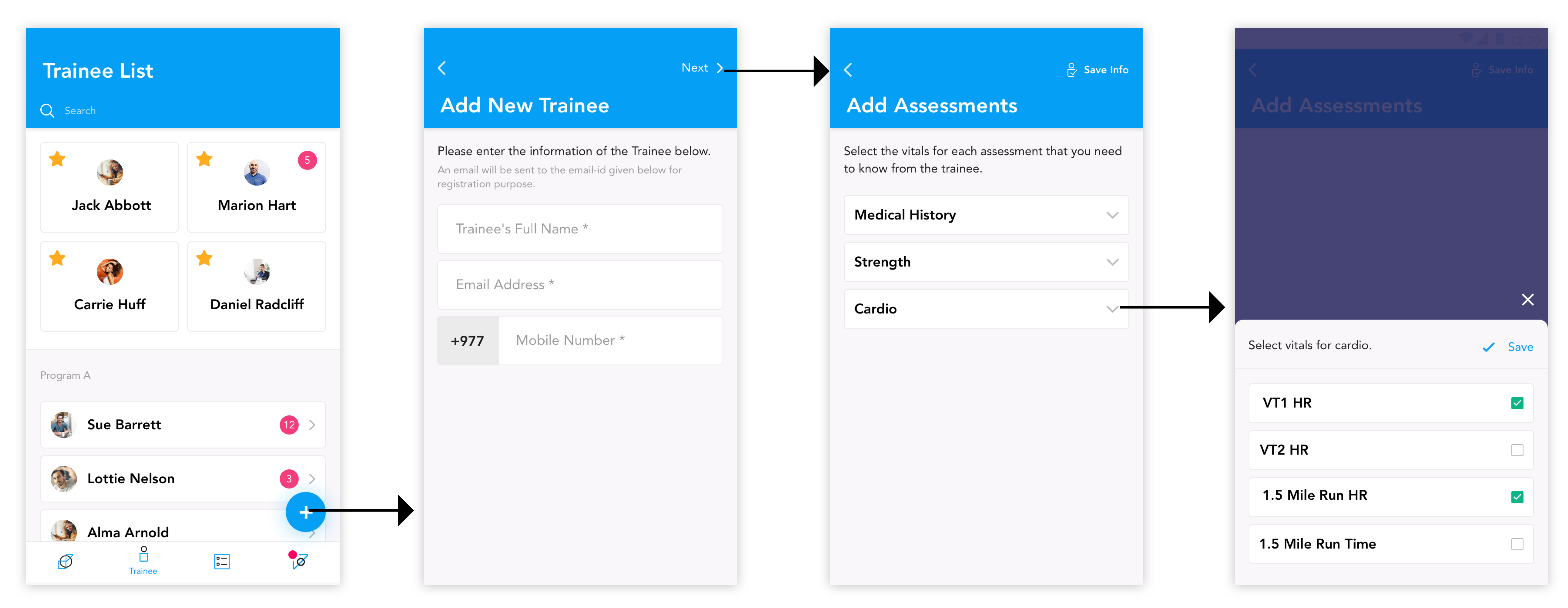
The app is not text-heavy. There is proper and wise use of colors and buttons, along with texts of varying font-size to reduce confusion.


Trainers use Google Document and Keynote to create a brief workout plan.

They use Google Sheet to create detailed workout plan. Each sheet contains the workout plan and schedule for one week.

Trainers at Gymkhana are dedicated, so are the trainees. Trainers are seen busy guiding the trainee.
Since the product goal was not limited to trainers, it was important to understand if we were designing only the trainer’s app for now. It was easier for my team to interview the target users of the product since the stakeholder was a professional trainer himself. We formed few crucial questions that clarified our target users as well as our design goals.
Who are our target users?
Why would they use the product?
What is the major problem they are facing currently?
What do they expect the product would be like? Are there any specific features that they wished they had in the application?
When and where would they use the product?
Has the trainer used any such apps before?

Increase Automation
Allow the trainers to easily add new trainees. Decrease their work load of having to manually create a plan for each trainee.

Effortless Organization
Enable trainers to add daily reports of their trainees in minimum clicks; without having to search the right document or sheet.

Simple User Interface
Keep the application aesthetically pleasing so that a lot of data does not overwhelm the app user.
The client introduced us to some of the existing applications that he currently used as a trainee. Through these applications, we identified the insights on different kinds of data that a fitness app uses. We compared the features each of these platform supported in order to define uniques features for our product that made our app better.
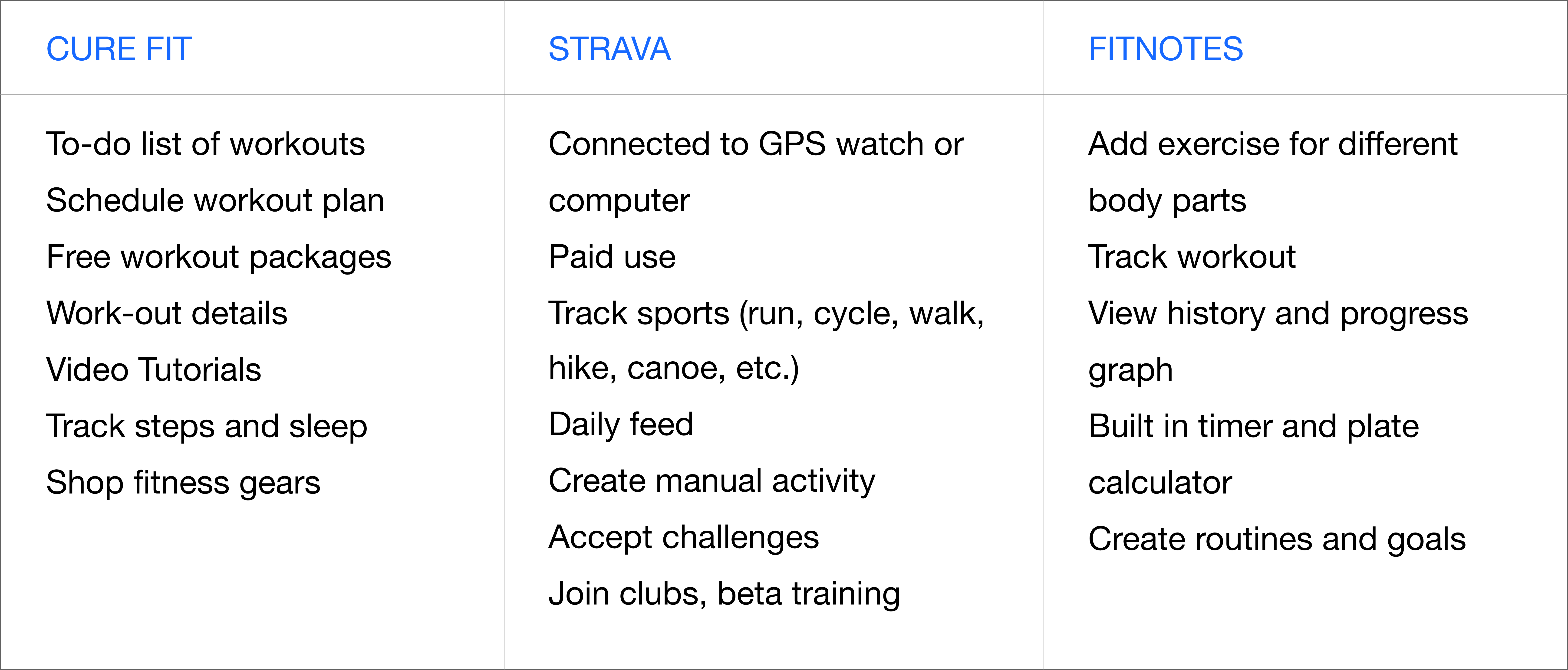
The applications provided by the client were built to help the user as a trainee. In our project, we analyzed each feature from these applications to understand the type of data that a trainee requires. These data are to be pushed by the trainer through the trainer’s app.
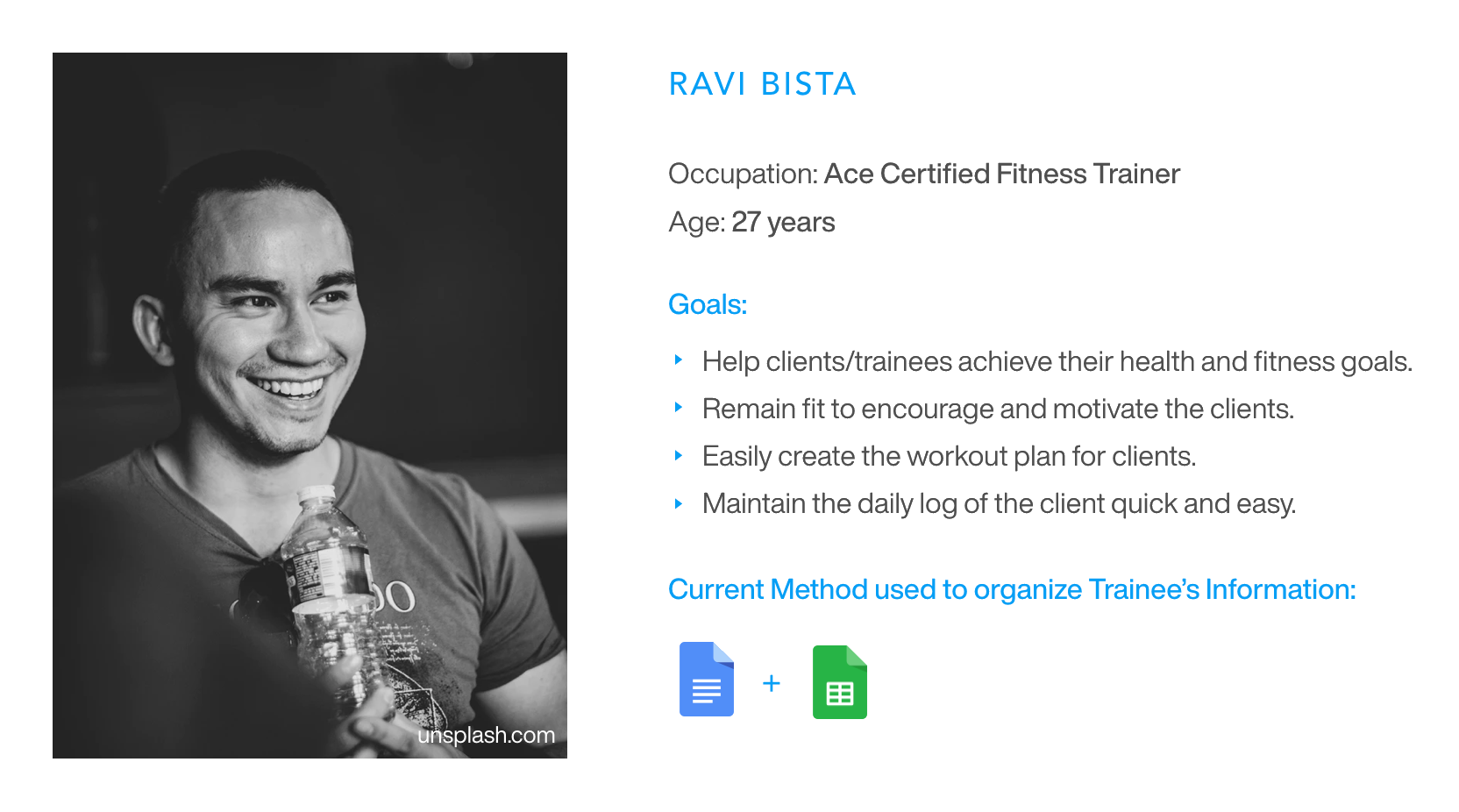
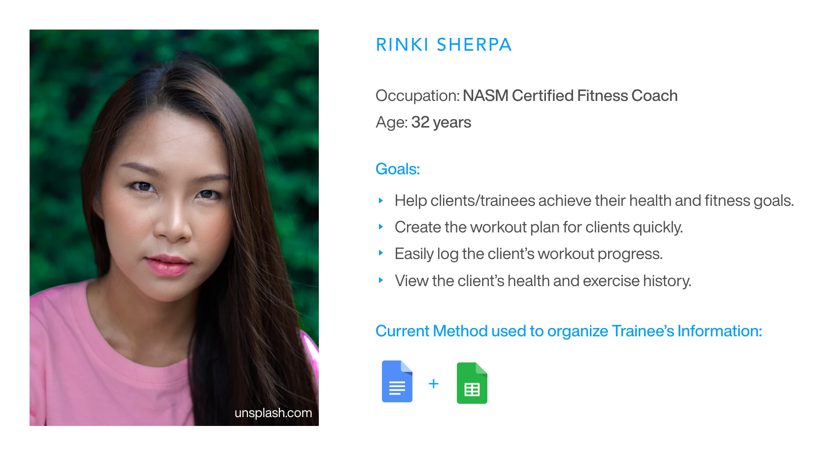
Momentum Shift is a fitness app for professional trainers who work at Gymkhana. Through this app, trainers are able to easily create and manage workout plans for their clients.

Create Workout Plan
Trainers are able to create lengthy workout plans easily with the help of in-built library that contains all the exercises.

Save Workout Plan
Trainers are allowed to save a workout plan so that they can use it again. Also, they are able to make changes while re-using the saved plan.

Add New Trainee
Trainers can easily add new trainers who will work under their guidance.

Manage Workout
Trainers can send workout plan to their trainers individually and view their workout and progress history.
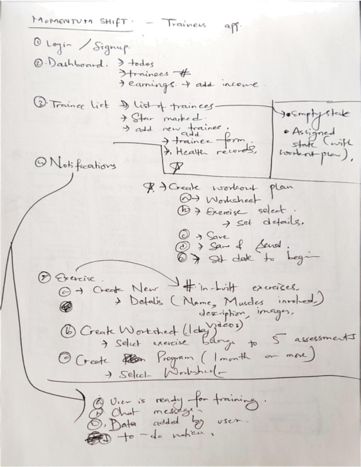
During the early stage of the design, our team sat together to discuss the main features for a minimum viable product (MVP). We used white-boarding to scribble all the features and define a rough flow of the app. We finally narrowed down the features and defined the most important ones for the first version of the product.
In a sheet of paper, we listed all the important pages to start building the low fidelity prototype. While working on any product, our team prefers to list the components of the dashboard at the end. Dashboard provides an overview of what is happening currently. To identify the most crucial data that the user needs to know, we listed the component of the dashboard at the end.
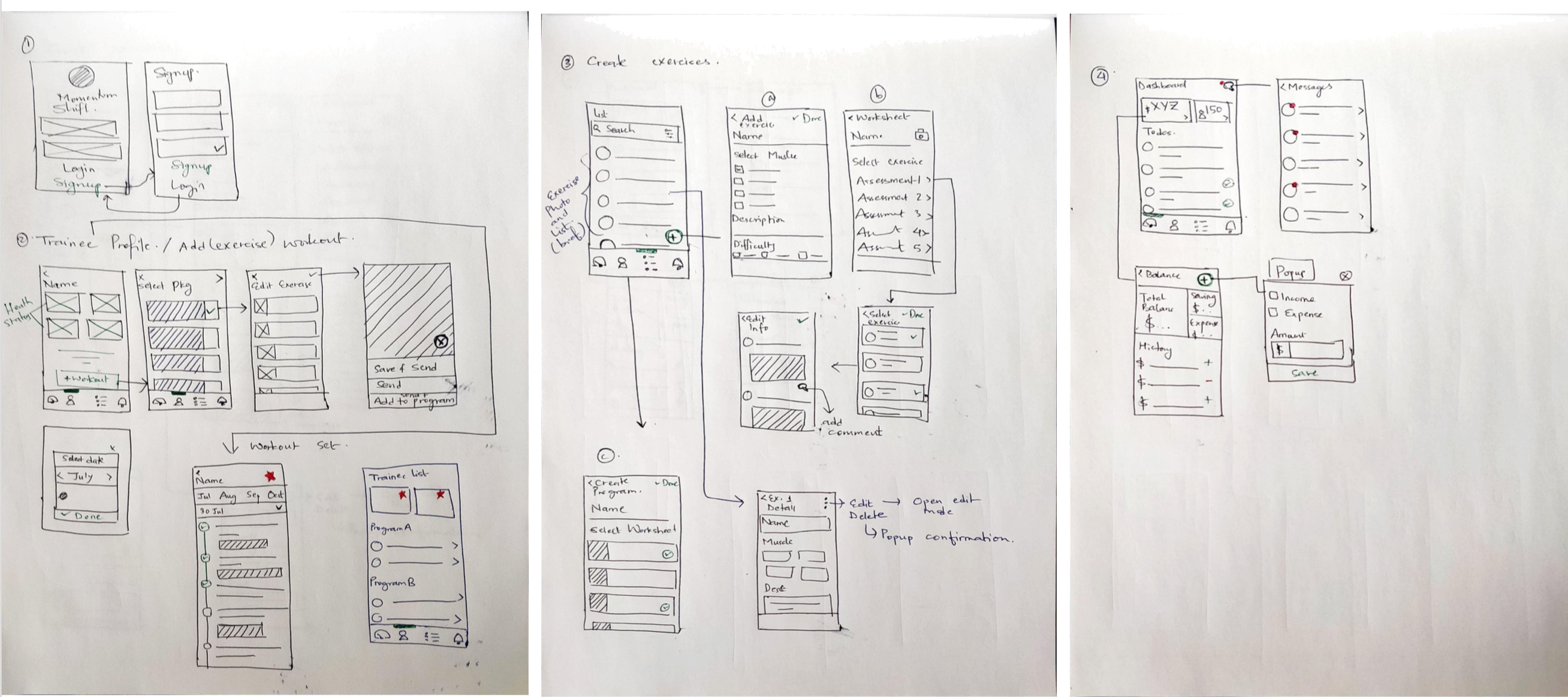
We preferred paper prototyping over other lo-fi design software. It was quicker and easier method for us, specially for an app which requires a lot of screens. Together, we spent a lot of time to define the initial flow of the application. We sketched four main features (flow) of the application:
Login and Signup.
Add exercise/workout plan for a trainee.
Dashboard: Messages and Balance (History, Add income/expense)
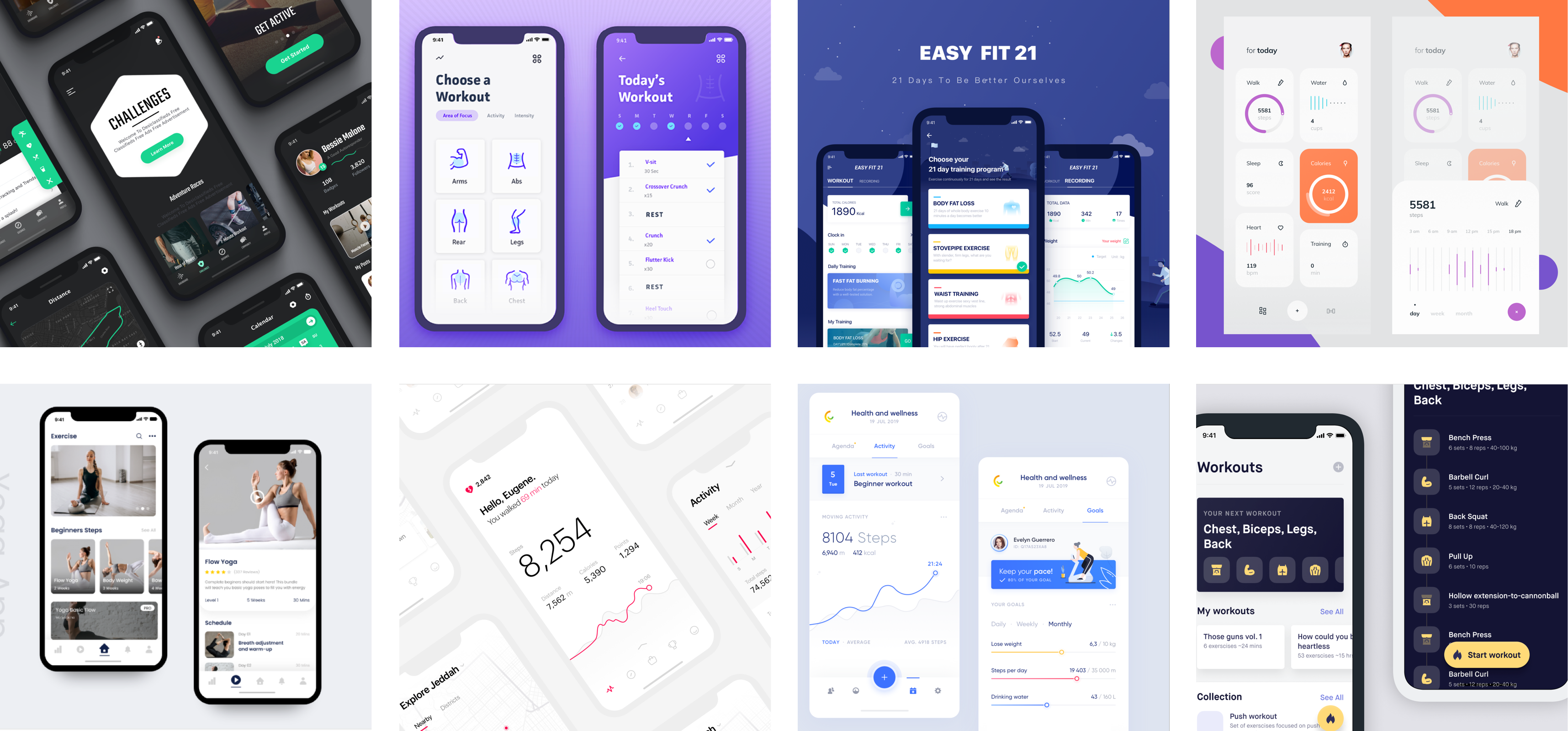
Metaphors for preferred Visual Look
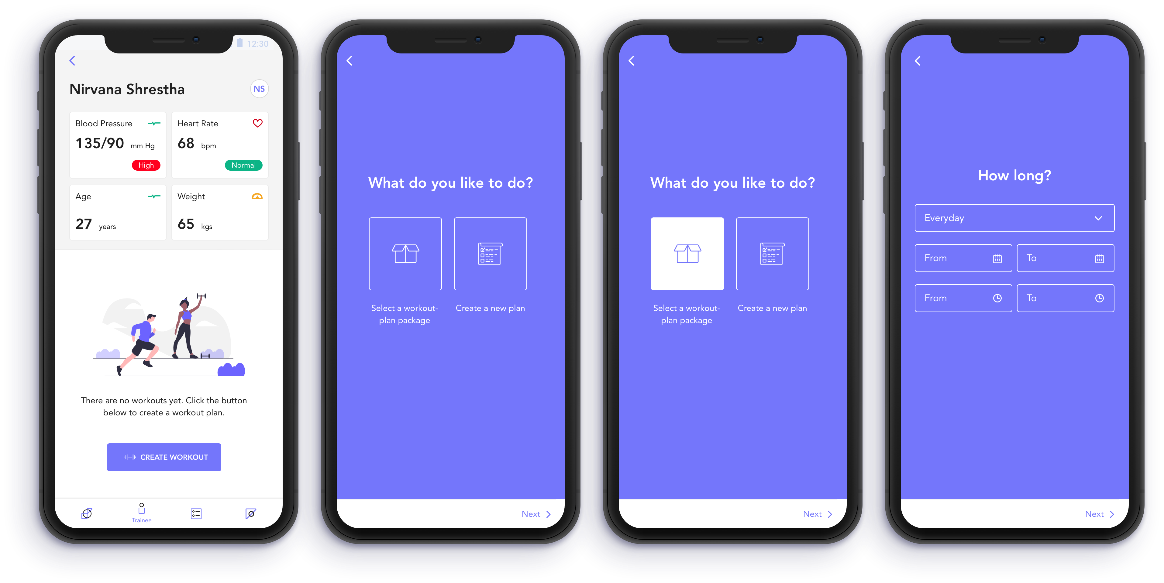
Based on the lo-fed paper prototyping, I created the user interface to demonstrate the flow to “create a workout plan” for a trainee. For illustrations, Sandeep Shrestha, our artist and illustrator ninja, helped me.
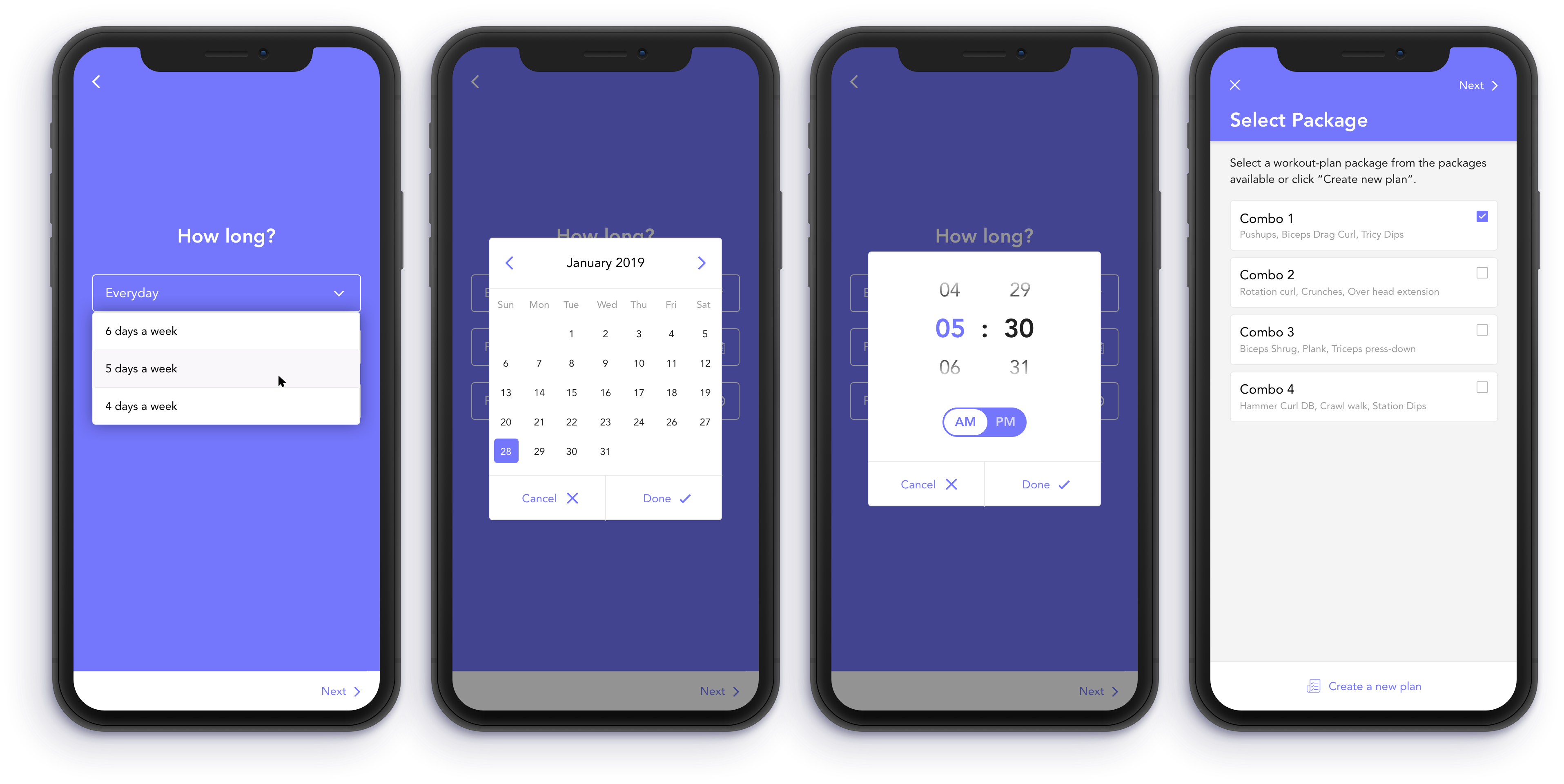
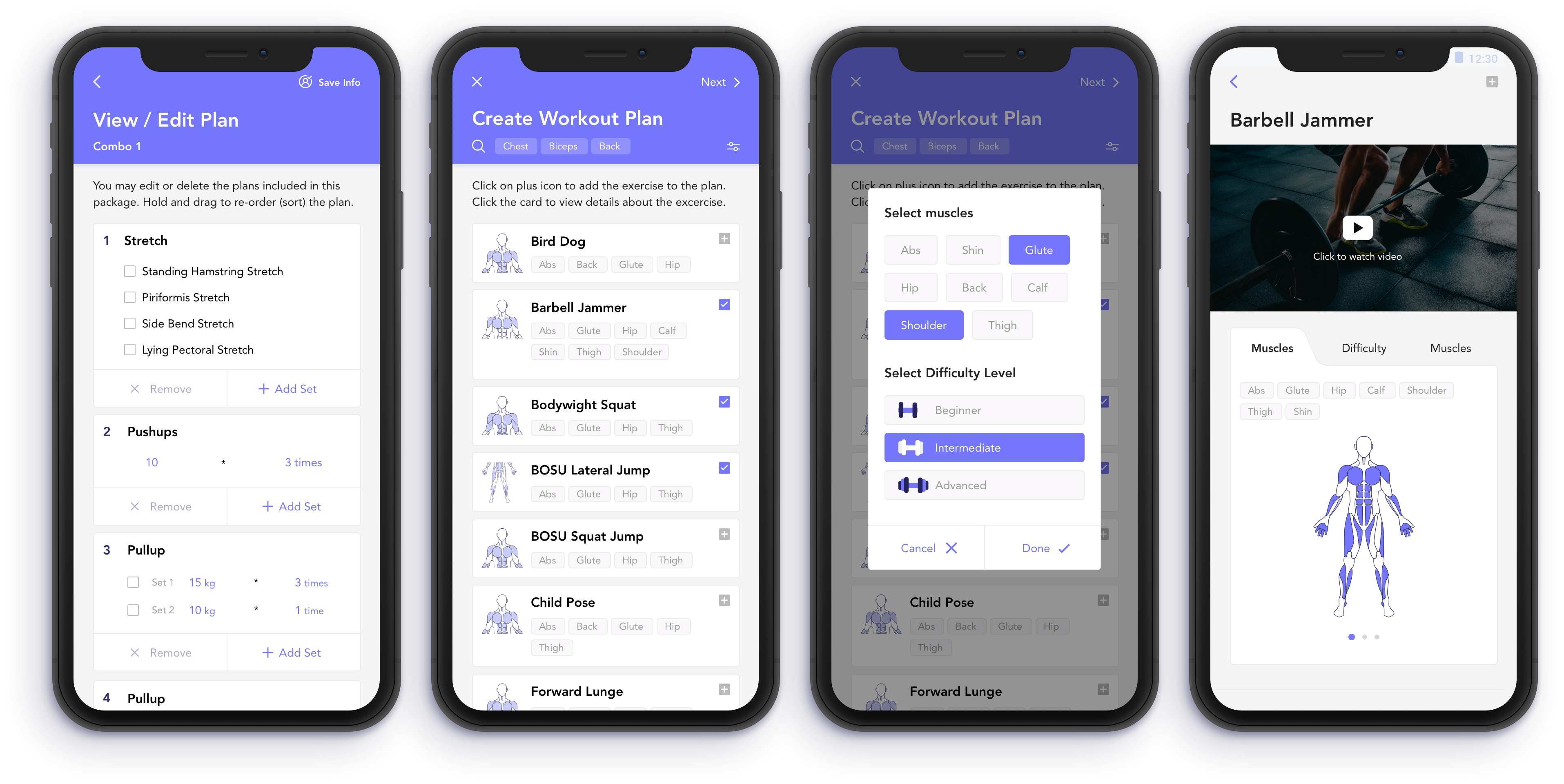
We conducted the user testing with a fitness trainer, who happened to be our client as well. For this product, we involved the backend developers as well as the application developers for testing the product. One major issue that occurred was the misunderstanding about the exercise, workout and program. On the other hand, it was very necessary for our team to understand the technical feasibility from the developers in order to proceed ahead with the design. After few days of discussions, we re-defined the designs based on our key findings:
An exercise is the base unit. A group of exercise forms a workout sheet, which is created only for one day. A program is a broader term. It contains a bunch of workout sheets that forms a long-term plan. E.g., one-month program, 3 months weight-loss program, etc.
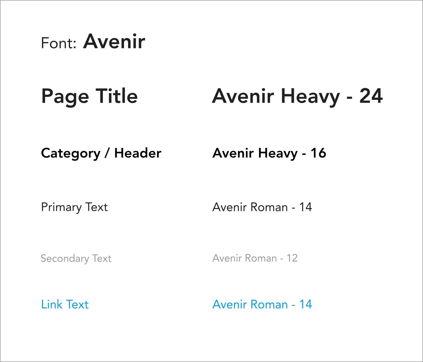
The font used for the app should look clear and user-friendly.
Trainers cannot assign the end date for a workout plan. There are other factors that needs to be considered such as trainee’s health, time preference, national holidays, and emergency leave.
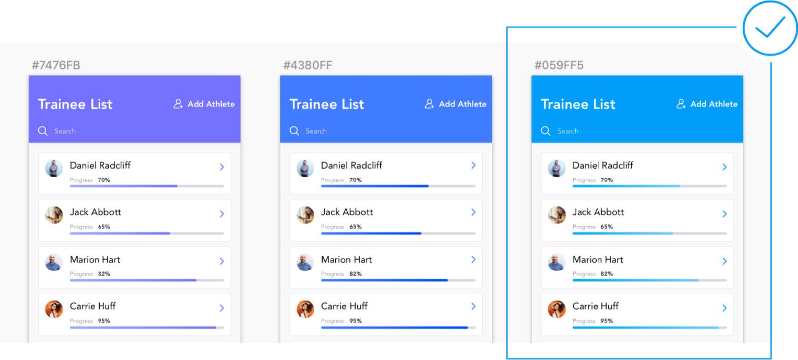
For a bright and user-friendly look, we had to experiment with the brand color of the app. Based on the feedback and discussions, I redesigned the application.
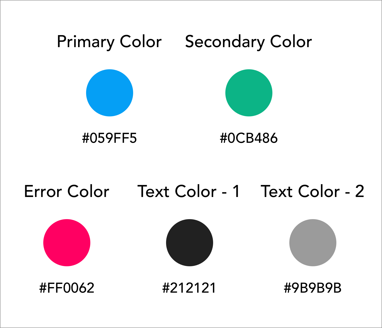
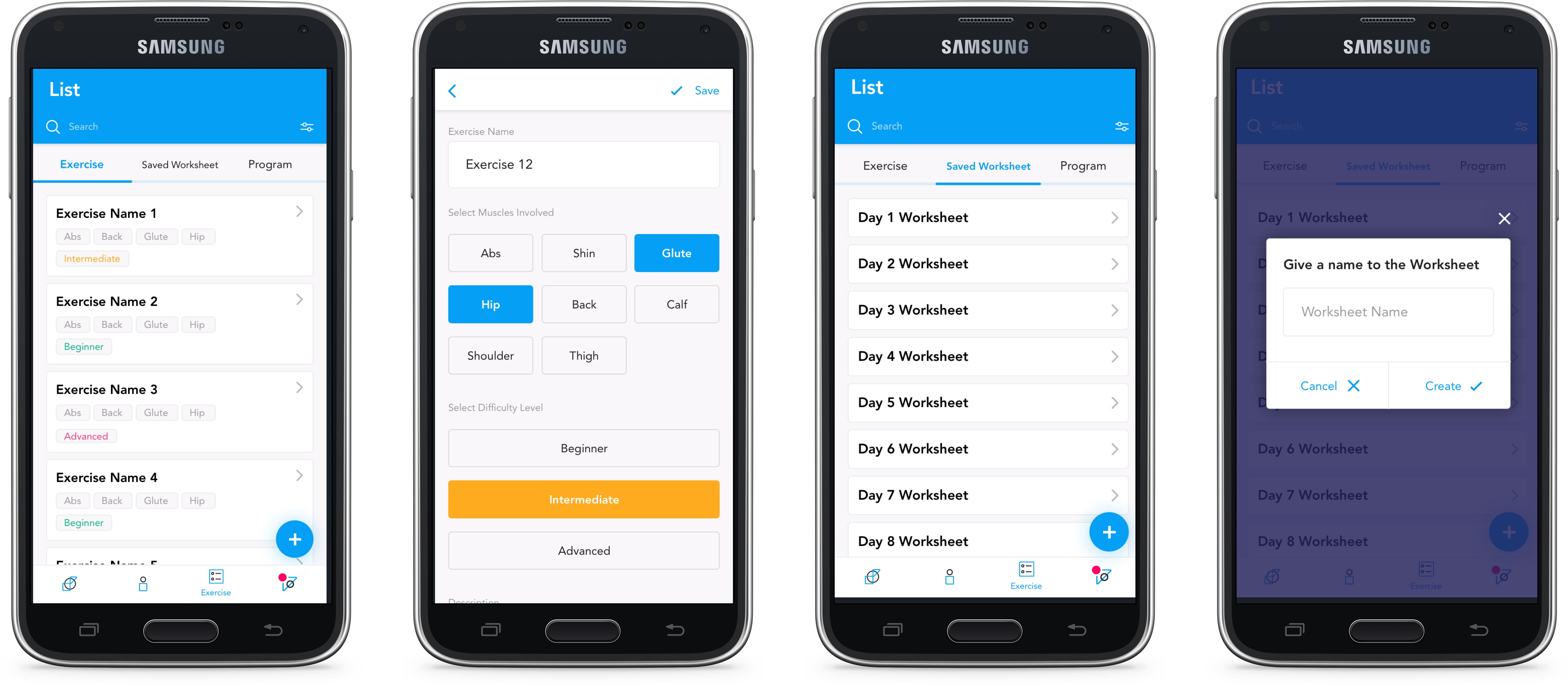
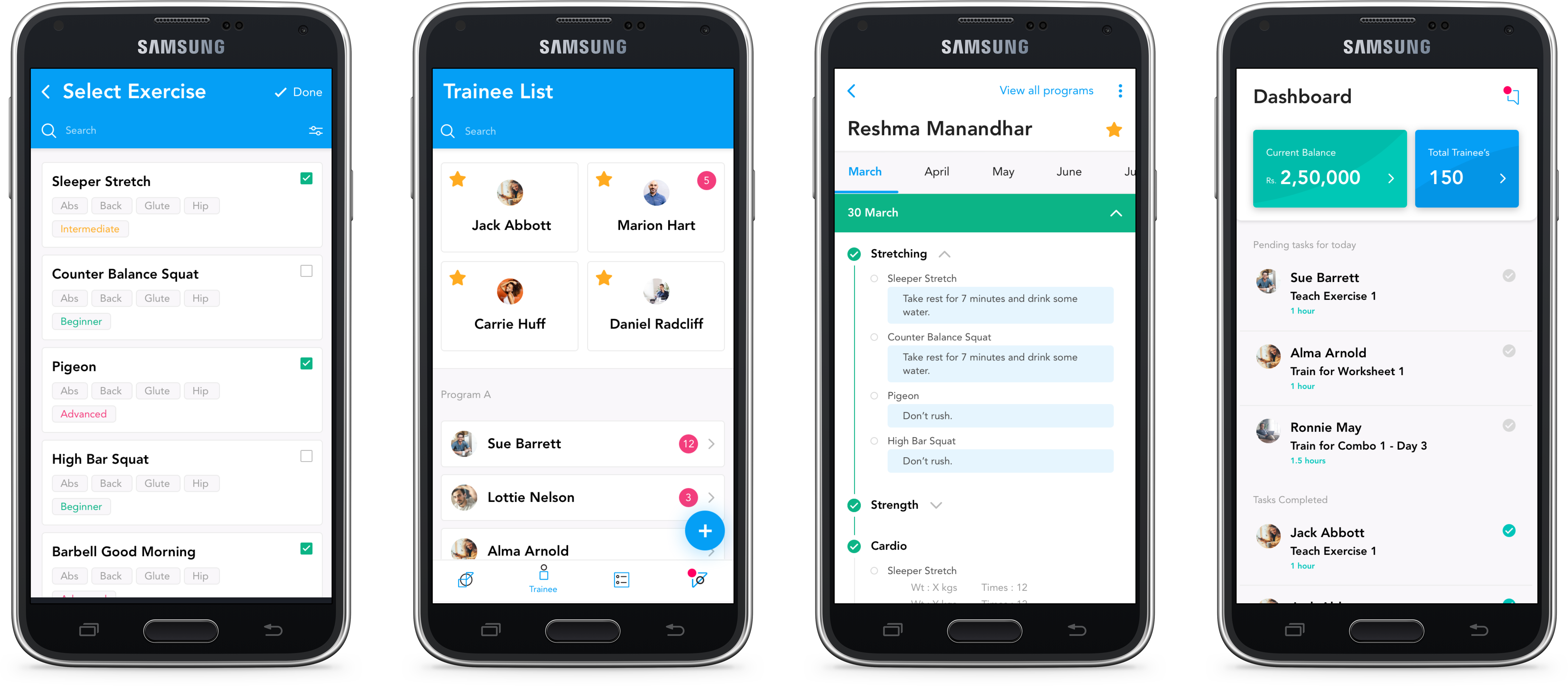
The next step will be to receive feedback from the client, run few iterations to get the final design, and conduct user testing.