

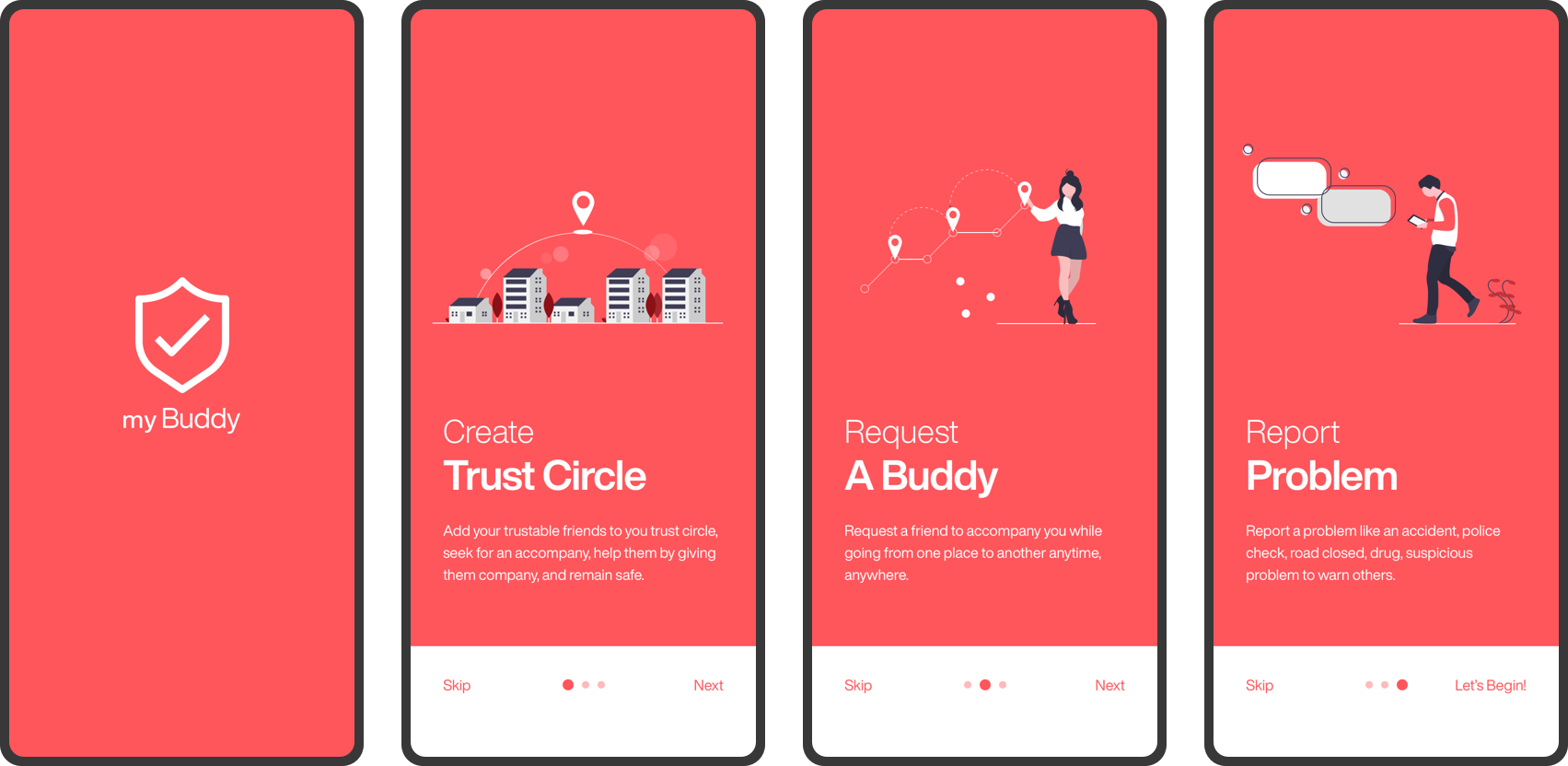
In this project, we present “MyBuddy App”, a mobile application that promotes safety through a social/collaborative platform. Through this application, we create trust circles for users so that they can help each other while traveling from one place to another, and help each other remain safe.
My Role:
As a designer, I conducted User Research with the students of campus in the form of interviews and analyzed the data to identify key points. I created the Storyboards, Low-fed prototypes, User-flow, Hi-fed prototypes, and an Interactive UI for Usability Testing.
Total Team Members / Duration:
3 members / 2 months
Tools Used:
Sketch, Invision, Adobe Illustrator
Crime has increased across college campuses in the United States within the last five years (Dept. of Education, 2019). While crime has been decreasing nationally in the United States, it has seen an increase in urban areas such as Chicago. Colleges and universities have implemented various crime prevention programs to help reduce the crime rate. Unfortunately, due to limited resources, many programs often have limited hours of operation and are often confined to areas within one block of the campus.
A social-collaborative platform for students, which allows them to add trustworthy friends to the trust-circle, request for an accompany or offer an accompany to a friend, and report suspicious incidents.
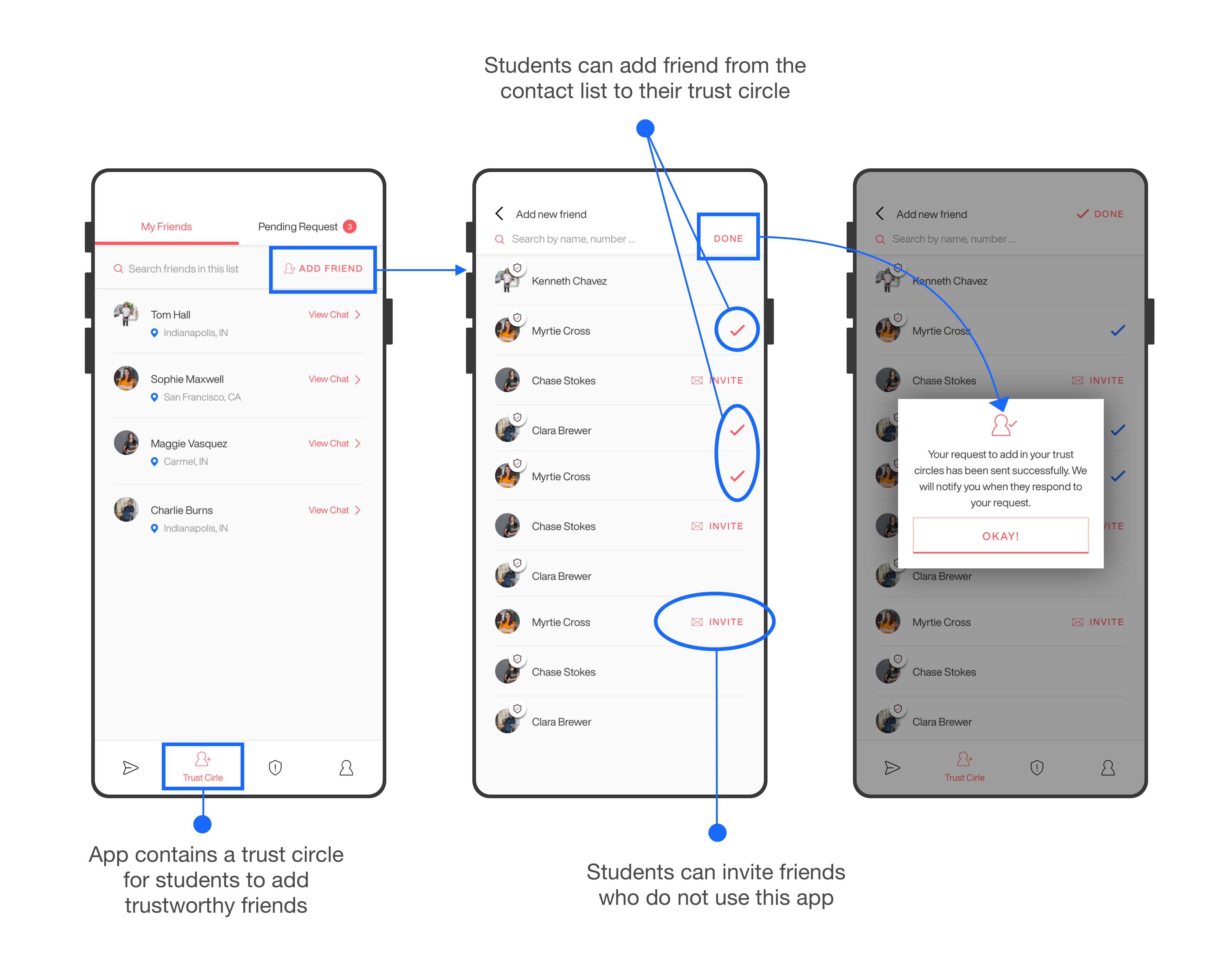
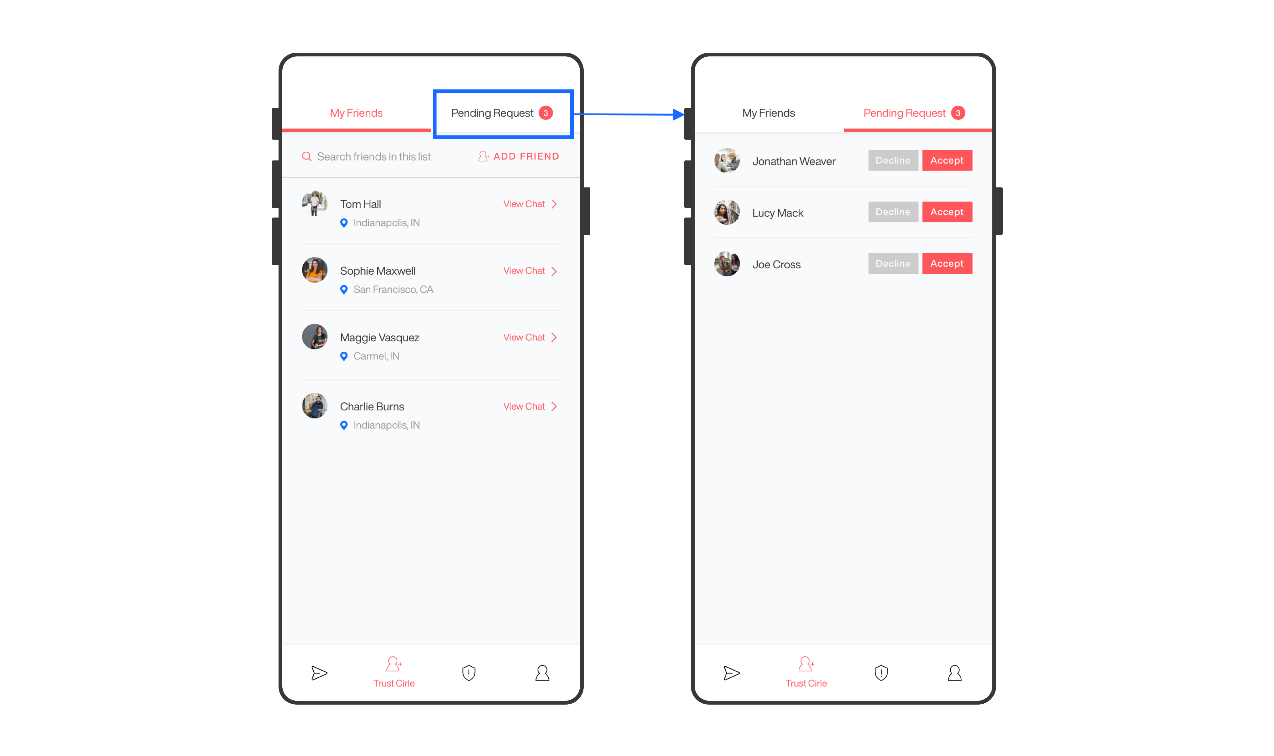
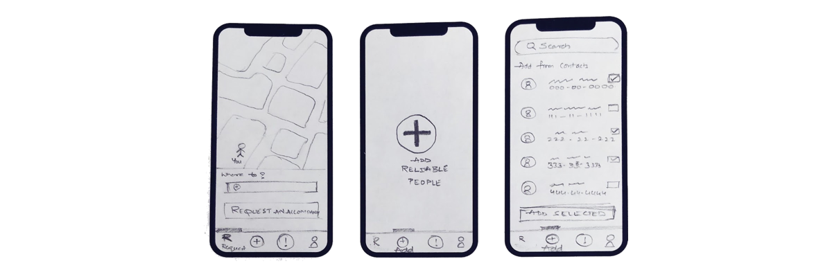
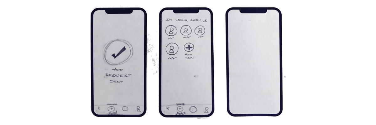
A trust circle which allows students to add new friends so that they can request them for accompany, and respond to pending requests from their friends. Students can add as many friends as they want, as well as invite friends who do not use this app.
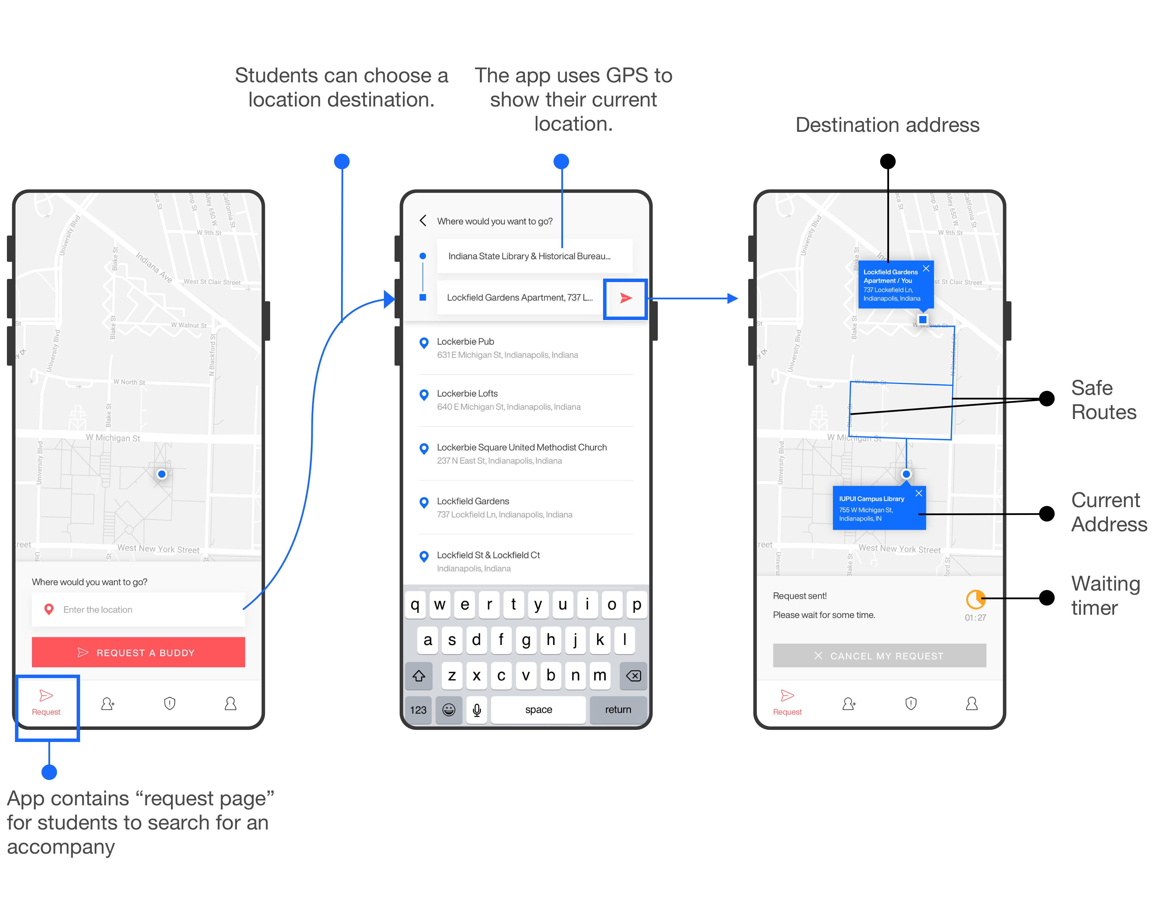
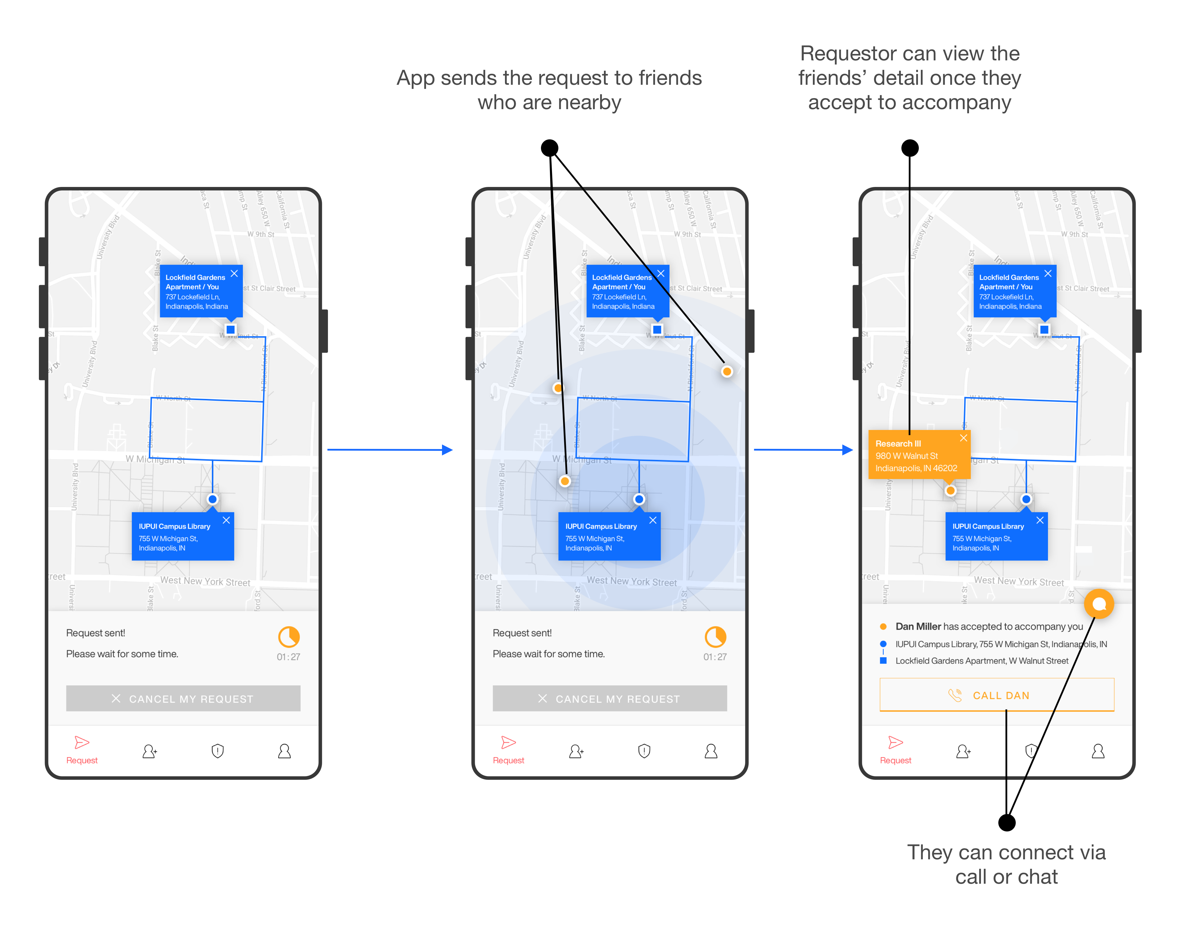
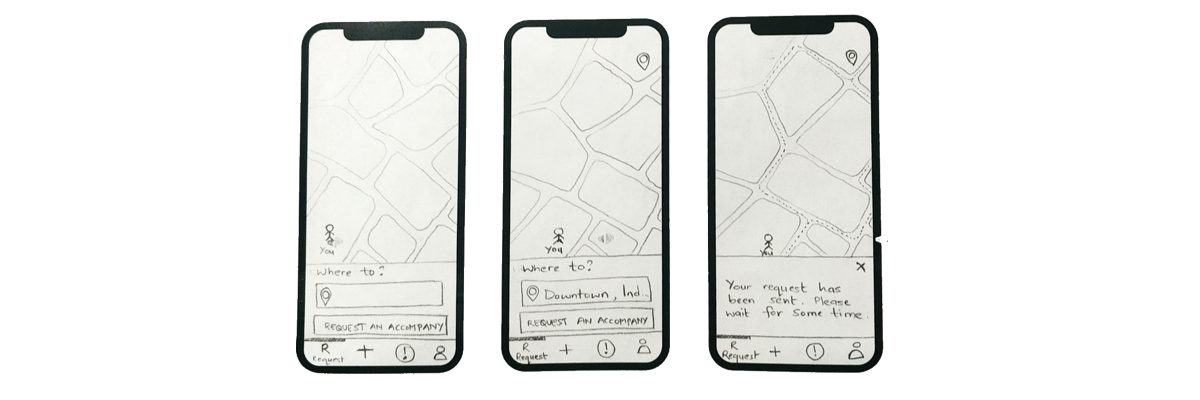
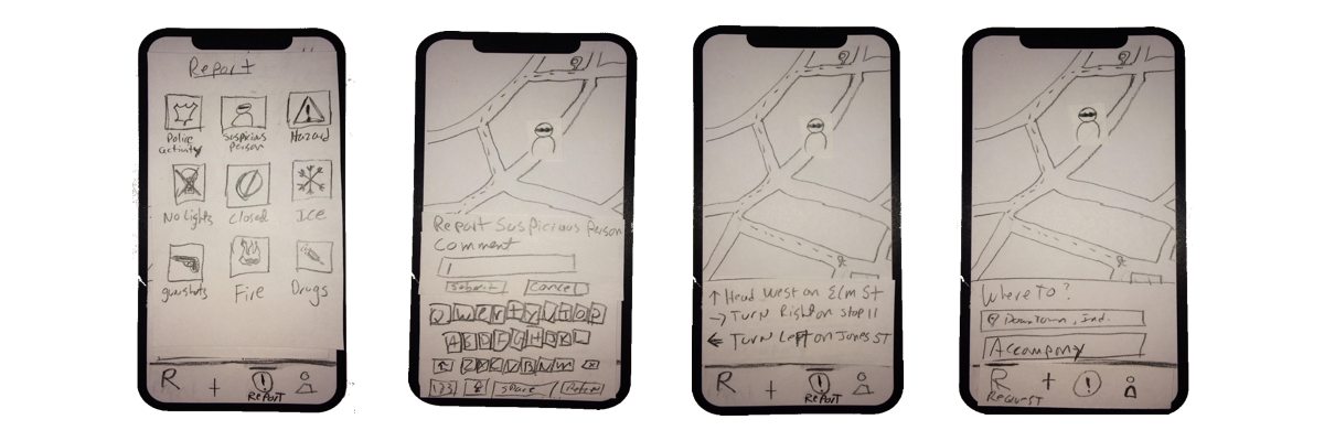
Students can request a friend to accompany them when going from one place to another. They can add their destination address and request for an accompany if they are scared to walk alone.
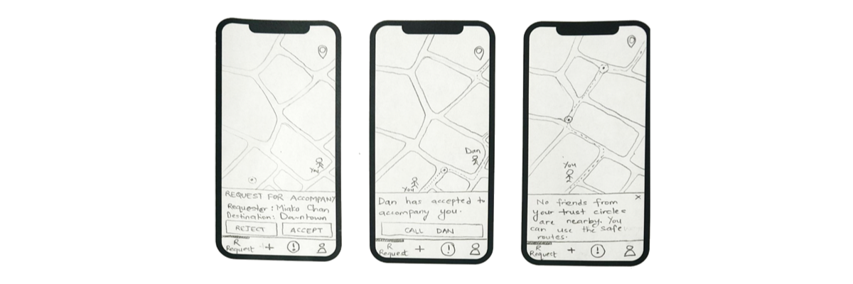
On the other side, friends nearby receive notifications to accept an accompany. After someone accepts it, they can connect either through a chat or a call.
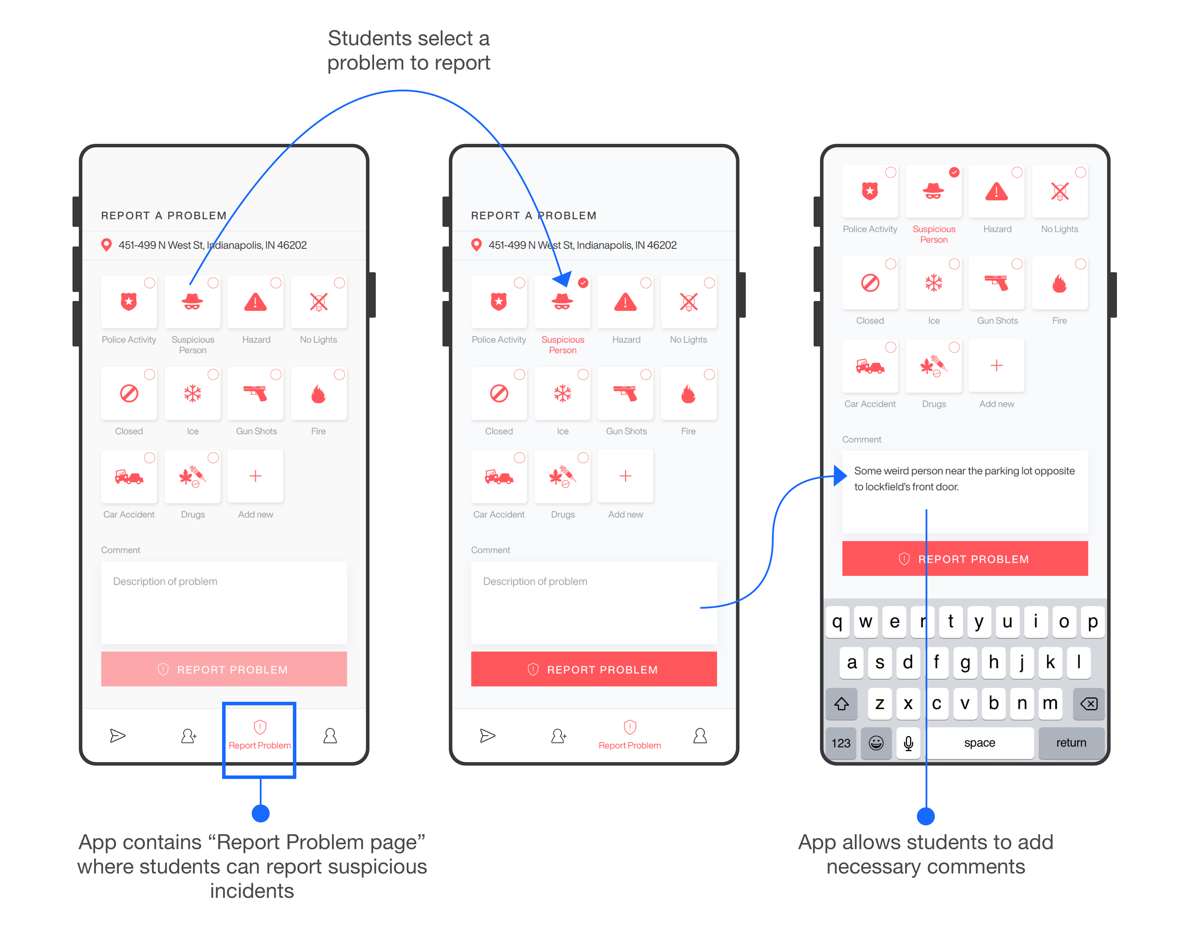
Students can report a problem when they encounter a suspicious incident while traveling from one place to another. They can select the problem, add necessary comments, post the issue, and help their friends avoid that route.
The users of this app are students of Indiana University, Indianapolis, who are those vulnerable groups to sexual assault and robbery. The users, especially female groups, find it difficult to trust strangers, even if they belong to campus safewalk. Our app focuses on all the students who are willing to collaborate to promote safety.
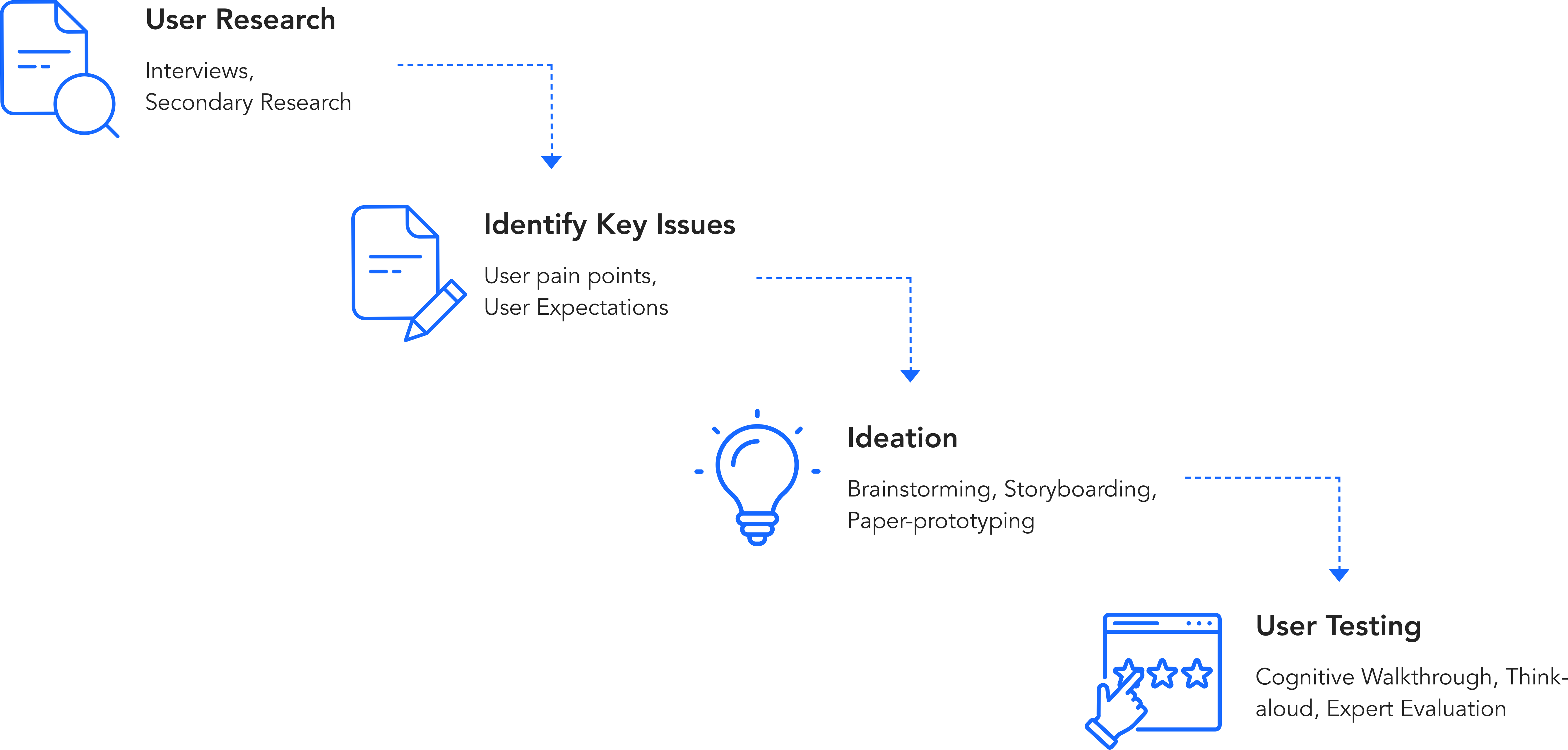
The primary goal of conducting the research was to identify the pain points of the user as well as acknowledge the existing methods and tools.
Interviews
We conducted 6 interviews, among which 2 were Graduate students and the remaining were Undergraduate students, to understand their overall experience with the existing method and tool used. This helped us delve deeper into the problems faced by the students and their expectations.
Secondary Review
We conducted a research of the existing tools and methods used. One of the major problem about these methods that we identified includes limitations in operation hours, less number of personnel, and limitation in locations. We also found that the overall crime rate has been increasing in the last 5 years.

Existing services lack off-campus service or service 24/7.

Overall crime rate has been rising in the last 5 years.

Students felt unsafe when traveling alone at night.

All the participants were willing to help their friends.
How might we promote campus safety through a social collaborative platform, where students can participate to accompany each other, and report suspicious incidents so that they can prevent their friends to avoid dangerous routes?
We brainstormed ideas individually and as a group which would address the problems that we identified from our primary and secondary research. We filtered all the ideas based on technological feasibility. After refining our ideas, we came up with two distinct solutions: a mobile application and a wearable device.
Ability to create “Trust Circles” – letting users add people in their close groups to seek help when they feel unsafe.
The mobile application is able to track the geo-location of a person on a real-time basis and share it to Trust Circles upon request.
An instant message sharing mechanism – letting users share safety-related information to friends who live nearby.
A reporting mechanism - letting users report suspicious or dangerous events occurring at a particular location.
Technical Requirements: Smartphone, mobile application, GPS sensor (switched on), user signup, adding trust circles, sharing alerts responsibly.
Wearable jacket safeguards the person when attacked by the assailant only upon activated before-hand.
Upon sensing the external touch, the jacket sends an alert to mobile and to the trust circles only when synced up wirelessly with the mobile application.
It should be a more convenient and approachable way to send the SOS alerts when the mobile phone is out of reach.
The jacket should be designed to be worn in all climatic conditions and should be activated when the person is alone and deactivated as soon as the person reaches their destination.
Once the brainstorming was completed, we shortlisted two systems, one with the mobile application for seeking help from trusted friends and another one, a wearable jacket where the person takes help only in an emergency situation.
Storyboarding-1
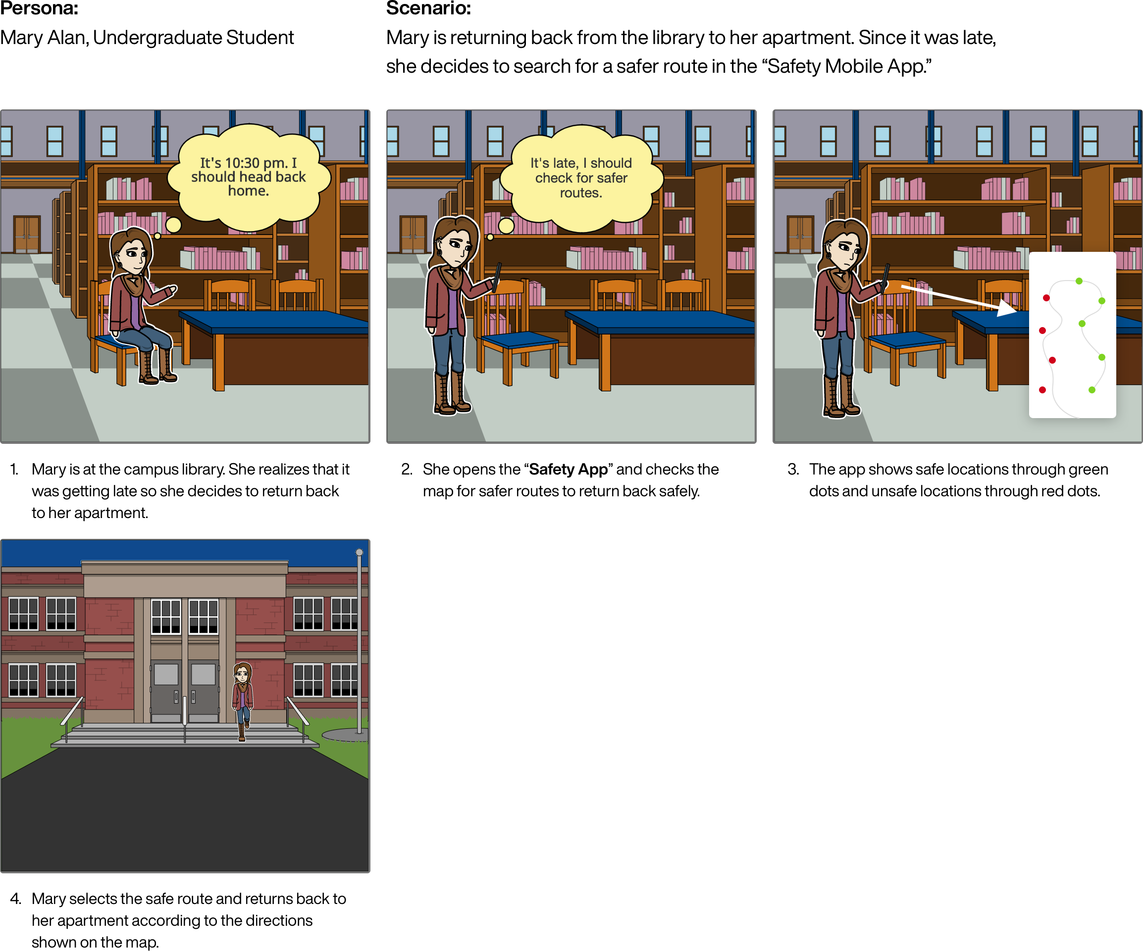
Storyboarding-2
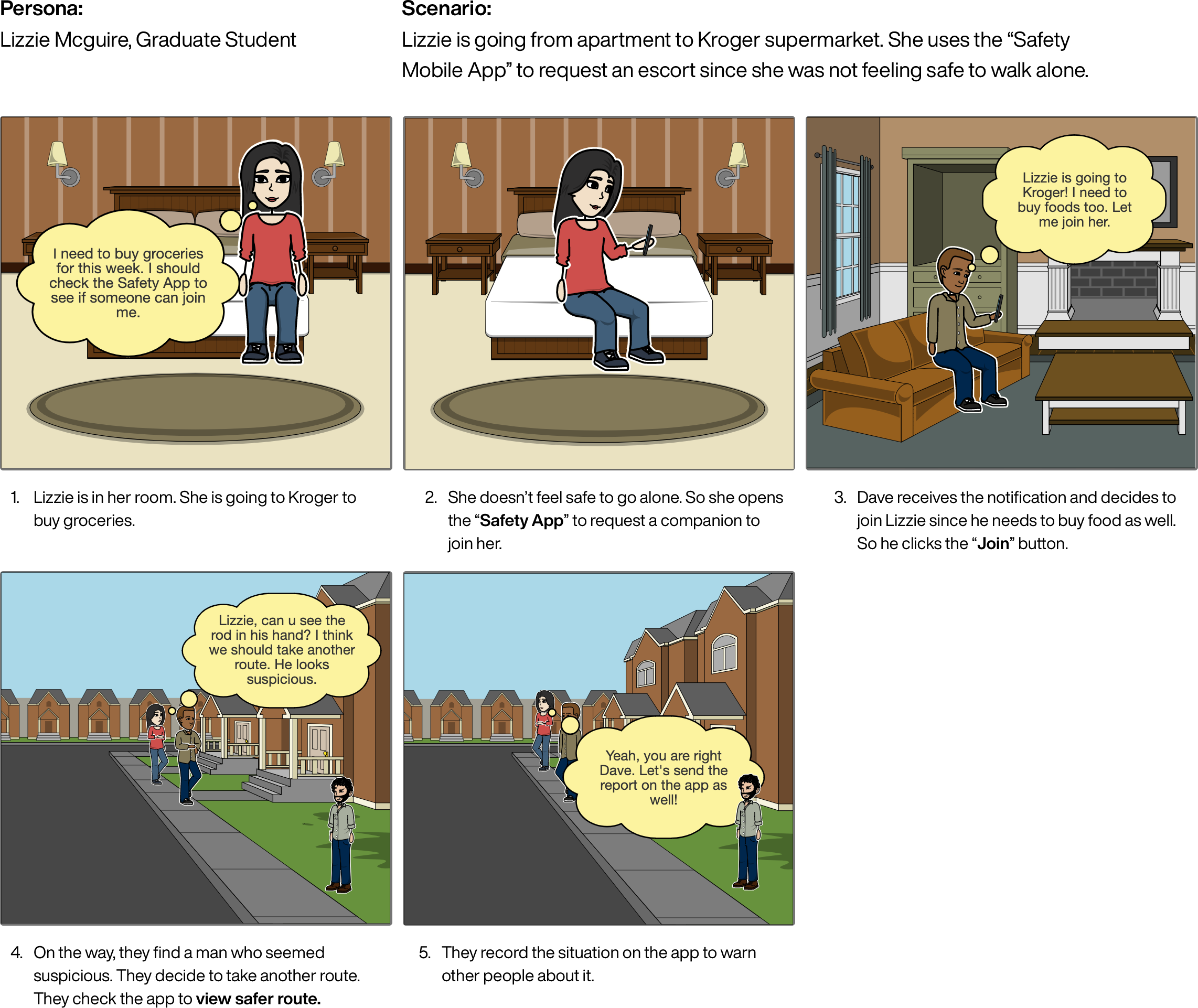
Storyboarding-3
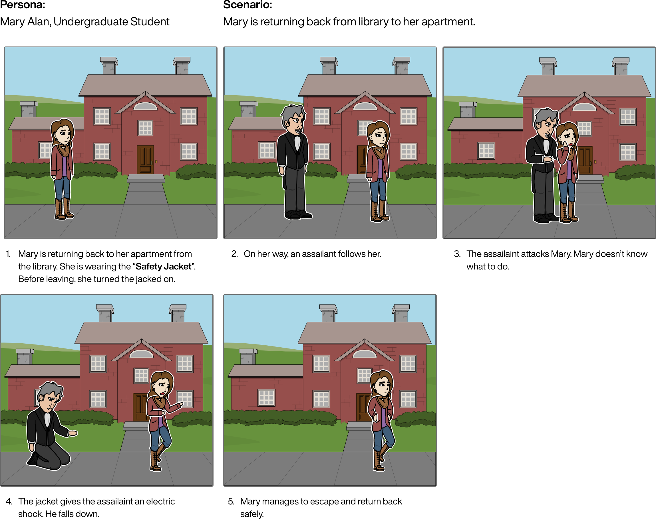
Storyboarding-4
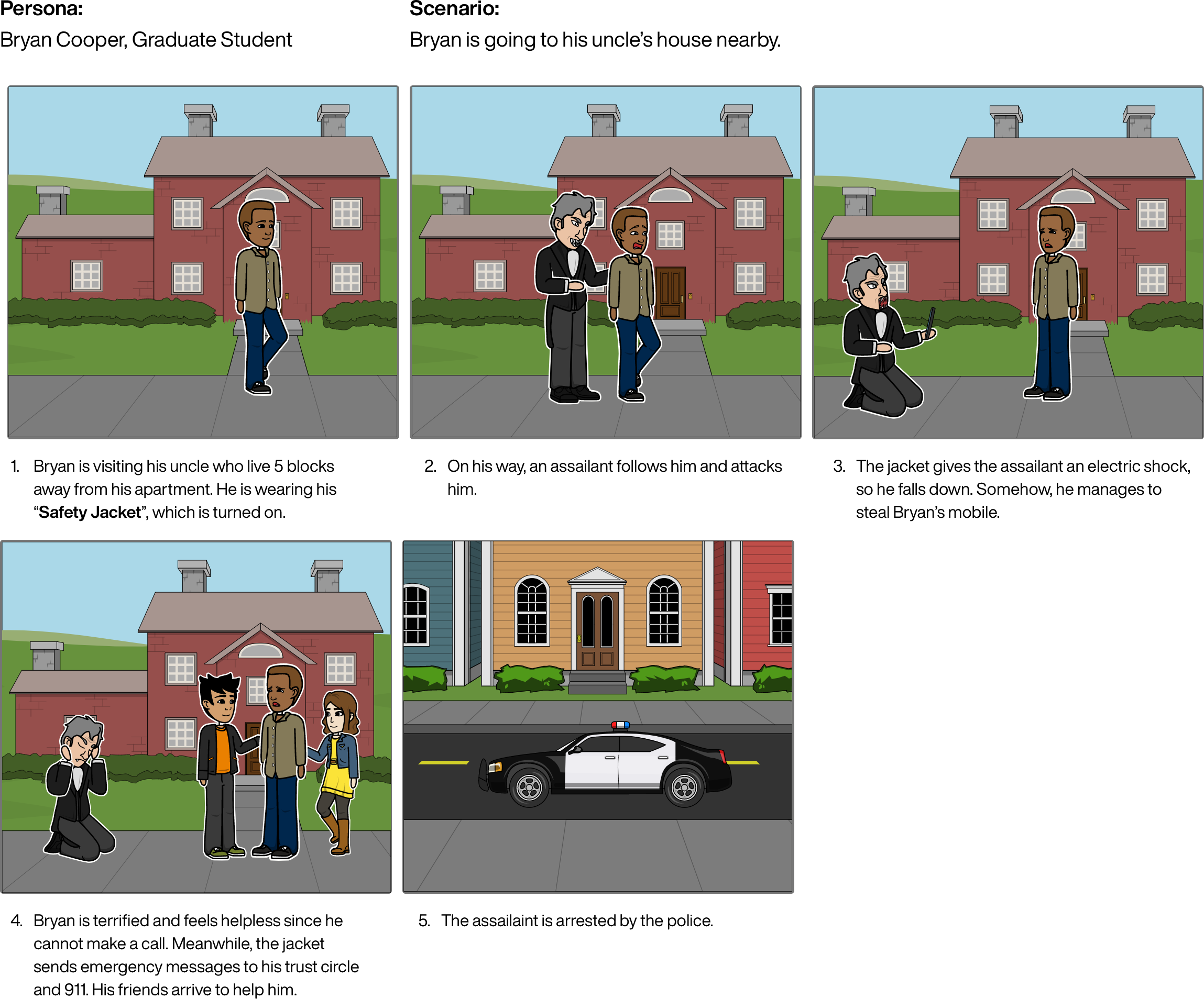
Based on the requirement of designing a social computing system, we decided to move ahead with the mobile application as our primary solution for a couple of reasons. Firstly, most users own personal mobile phones and are accustomed to using it. Secondly, users are familiar with social networking platforms such as Facebook, Instagram, and WhatsApp. This makes it easier for them to understand the idea of our solution, which is a collaborative platform, that requires individual participation to function effectively.
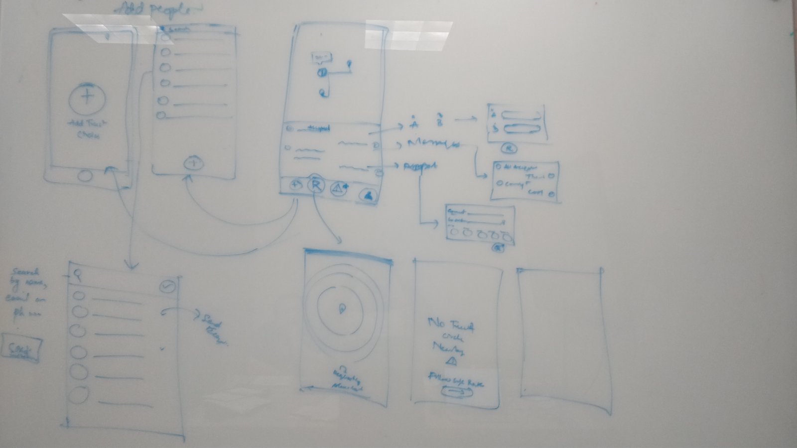
We made several sketches to figure out the process of creating trust circles and how we envision the app will work. Once we all agreed on a specific direction about how the app would function we then made our prototypes for each of the core features and performed our cognitive walkthroughs. We further reviewed each other’s notes and made some cosmetic adjustments. We found four key findings that need to be addressed prior to working on the dynamic prototype:
On the request screen, we have the same space dedicated for directions (map view) and request form (to send a request for an accompany) so that users just see one or the other.
The ability of the requester, who sent a request for an accompany, to receive a confirmation that the escort request was accepted.
The need to educate new users that adding multiple trust circles to various geolocations can be beneficial.
The process of how a user, who uses the app, sends a request to someone who does not have the app installed.
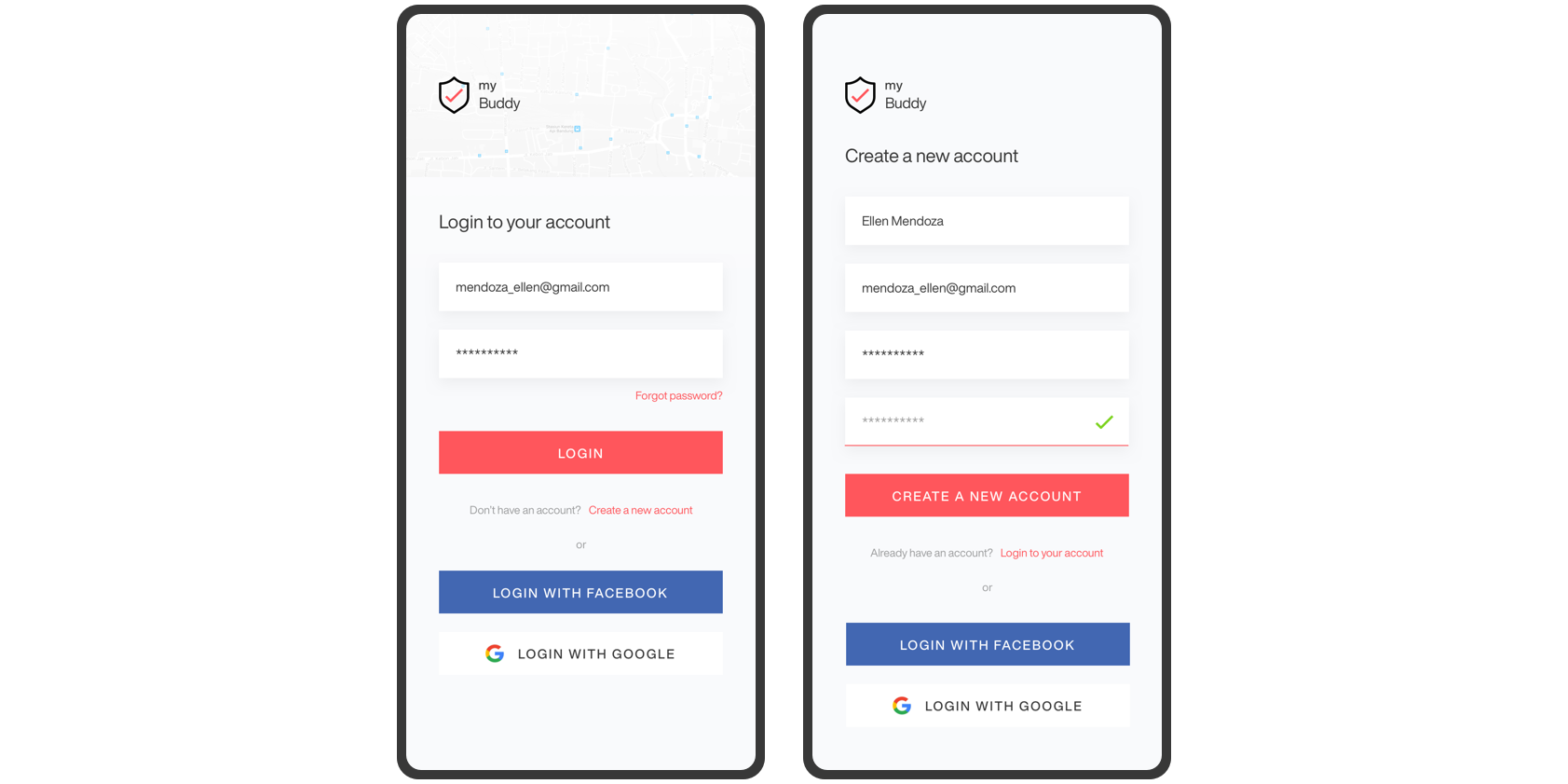
Login/Signup

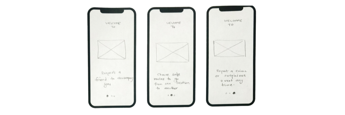
Onboarding
Request for trusted company
Add people to trust circles
Report incident
After conducting the cognitive walkthrough, we found a few issues that need to be addressed for the high fidelity prototypes:
We are not sure how we will handle the map view (with written map directions) and the request form view (for an accompany) since they both occupy the same space on the mobile screen.
There is lack of a confirmation message to the acceptors (who accepts to accompany the requestor). Users may not be sure if their acceptance has been processed unless they receive some form of confirmation.
It is not clear in the prototype about how a user will send an invitation to a new user, who hasn’t installed the application yet.
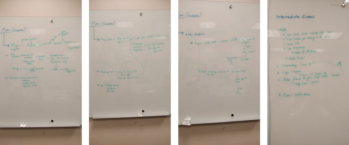

We started out with paper sketches to generate ideas about how we wanted the app to look and function. Once we settled on a design decision, we created a high-fidelity prototype of myBuddy using Sketch and then added the interactive elements using InVision.

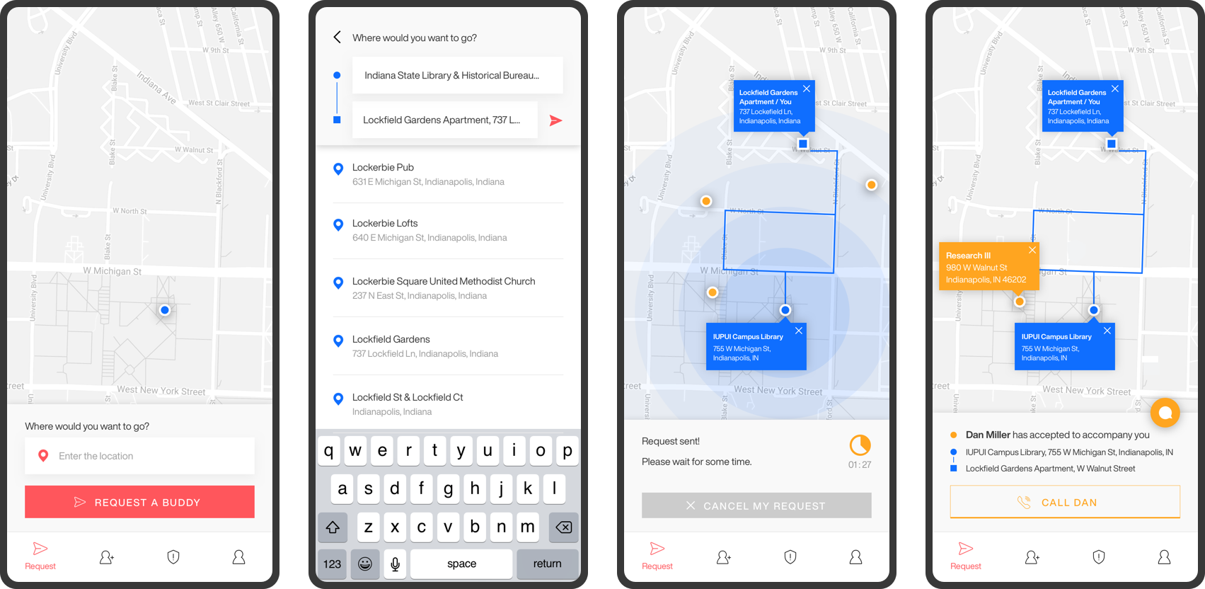
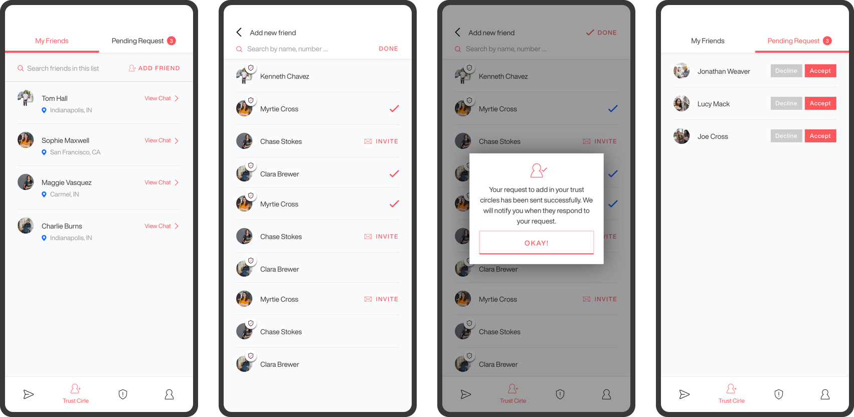
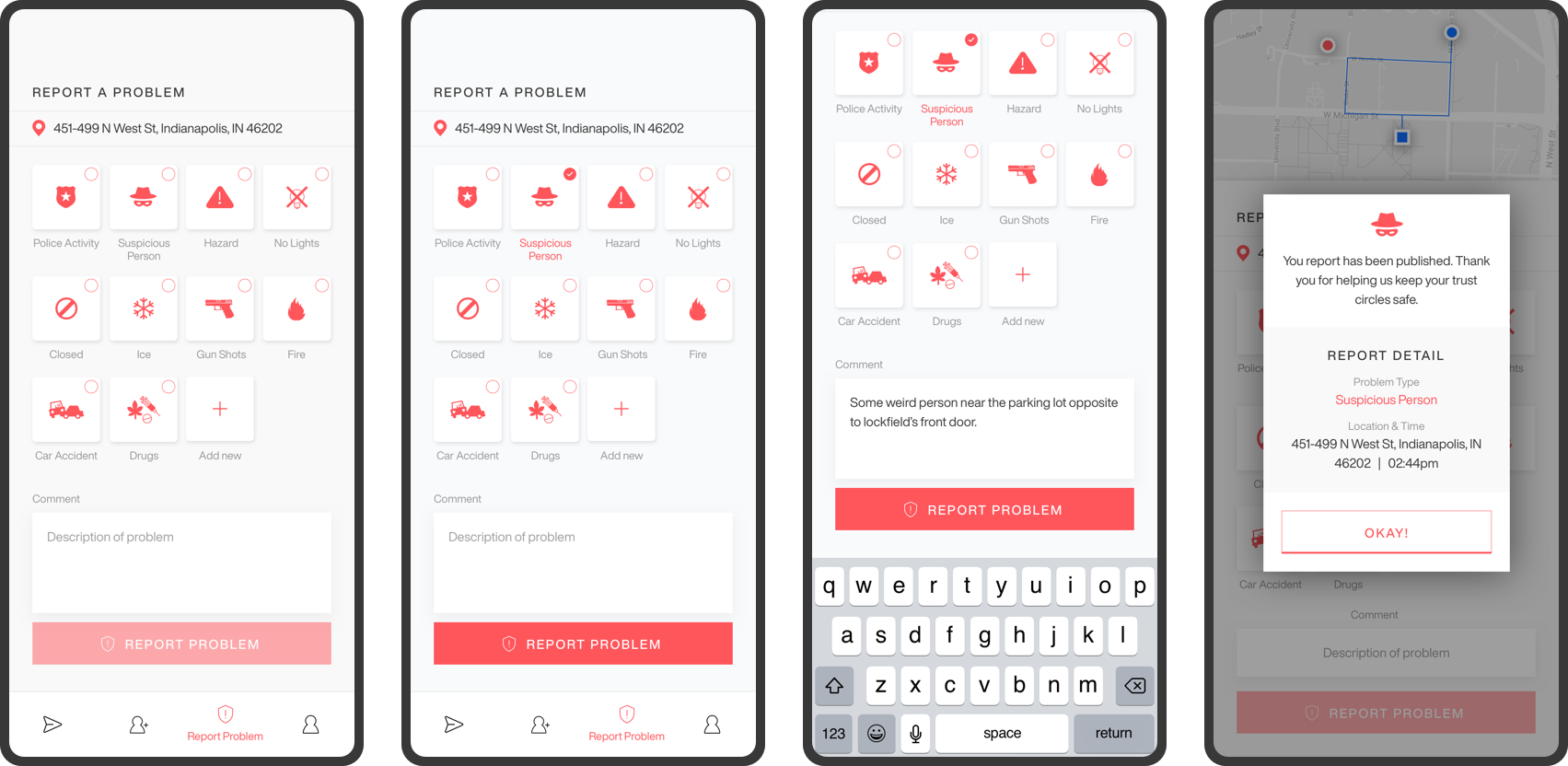
We had four participants conduct a think-aloud using three scenarios that were the main features of myBuddy. The first scenario was to request a Buddy, the second to report a suspicious person, and the third was to add a contact to their trust circle.
The participants did encounter a few errors using myBuddy and commented about several user interface elements such as:
The text button was too small, and it was unclear what it was.
The color dots and squares representing users and locations were too similar.
The report screen included a map where the user had to scroll to see the submit button.
The incident icon on the map was too small.
Add a friend to trust circle had as confusing check mark.
Our group met and discussed these issues and we made the appropriate changes such as making icons bigger, changing colors, removing some elements, and making sure done of the screens scrolled.
Once we were satisfied with the updates we made, we prepared our evaluation packets which contained information about who we are, the purpose of the evaluation, and instructions for completing the evaluation. We emailed the packets to ten experts and we received six replies. We recruited four UX Professionals and two second year HCI graduate students to evaluate the myBuddy application. Among the UX Professionals, two are MS-HCI Graduates of IUPUI working at Unity and Leoforce. We asked each expert to perform 3 tasks: Request a Buddy, Report a suspicious person, Add a friend to Trust Circle. Some of the issues that we identified are given below.
Expert Questionnaire
Their impression of the myBuddy was divided. Three experts had a very positive view of myBuddy, while two had a very negative view. This split was also reflected in how they rated the overall concept of myBuddy, three positive and two negatives. On the plus side all the experts thought myBuddy was easy to use and rated the “look and feel” of the app in a positive way. When asked if they would recommend the myBuddy to a friend the answers were across the board from not likely to likely.
Expert Interview
Each expert cited ethical concerns when users are reporting problems. Every user will have their individual perception about another person and their safety. Race can play a major role in the way people judge each other as well as the homeless or panhandlers, or those who may have a mental illness. With that in mind our experts also raised concerns about false or fake reporting.
Other feedback that we received spoke about including university officials and student association into the app. Also, the evaluators mentioned that people would use existing social media and communication applications, like Facebook and WhatsApp, for contacting their friends. From our research about existing apps and escorting programs, we found that there are a limited number of personnel for escorting for a limited amount of time. Facebook includes the feature of adding close friends, but the purpose of this feature is to notify users when their close friends are nearby. Our goal remains on creating a social group where users can send a “Request for a Buddy” to their close friends nearby without disrupting their privacy.
Keeping the comments provided by experts in mind, our next step would be to conduct a survey and interview about whether users would prefer to use myBuddy app or use existing social media apps like Facebook that integrates the feature of myBuddy app.