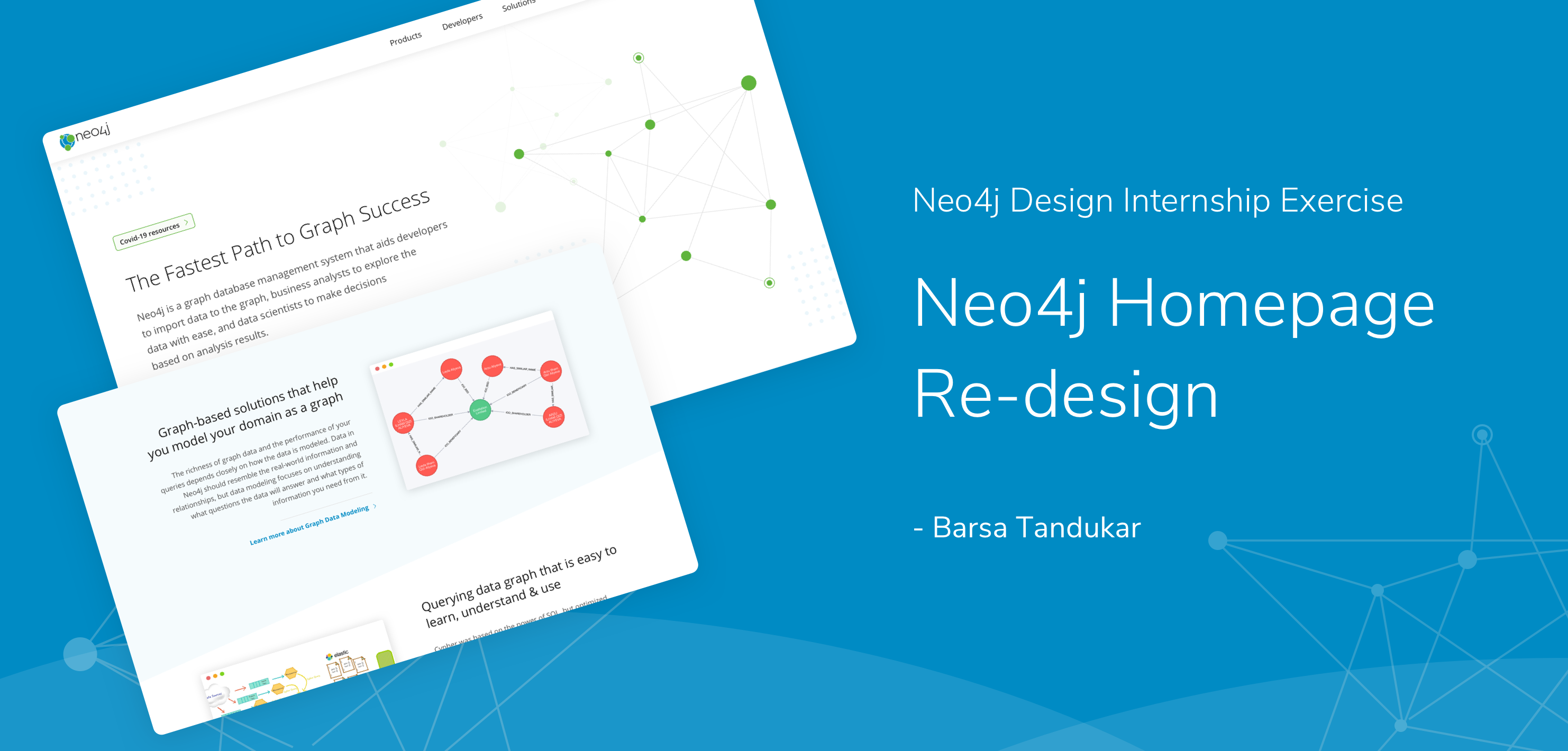

This project is about the redesign of Neo4j website. The purpose of this redesign is to make the website more developer-centric, while also promoting events, books, and other marketing resources.
Type:
Design Challenge
Skills Applied:
User Research, User Persona, Competitive Analysis, Heuristic Evaluation, Paper-prototyping, Hi-fed Prototyping
Software:
Sketch, Invision, Procreate
Duration:
24 hours
Platform:
Web
Disclaimer: This is a 3 days design challenge. I am not a pro-user of Neo4j. I have done the redesign based on my research, findings, analysis, and experience.
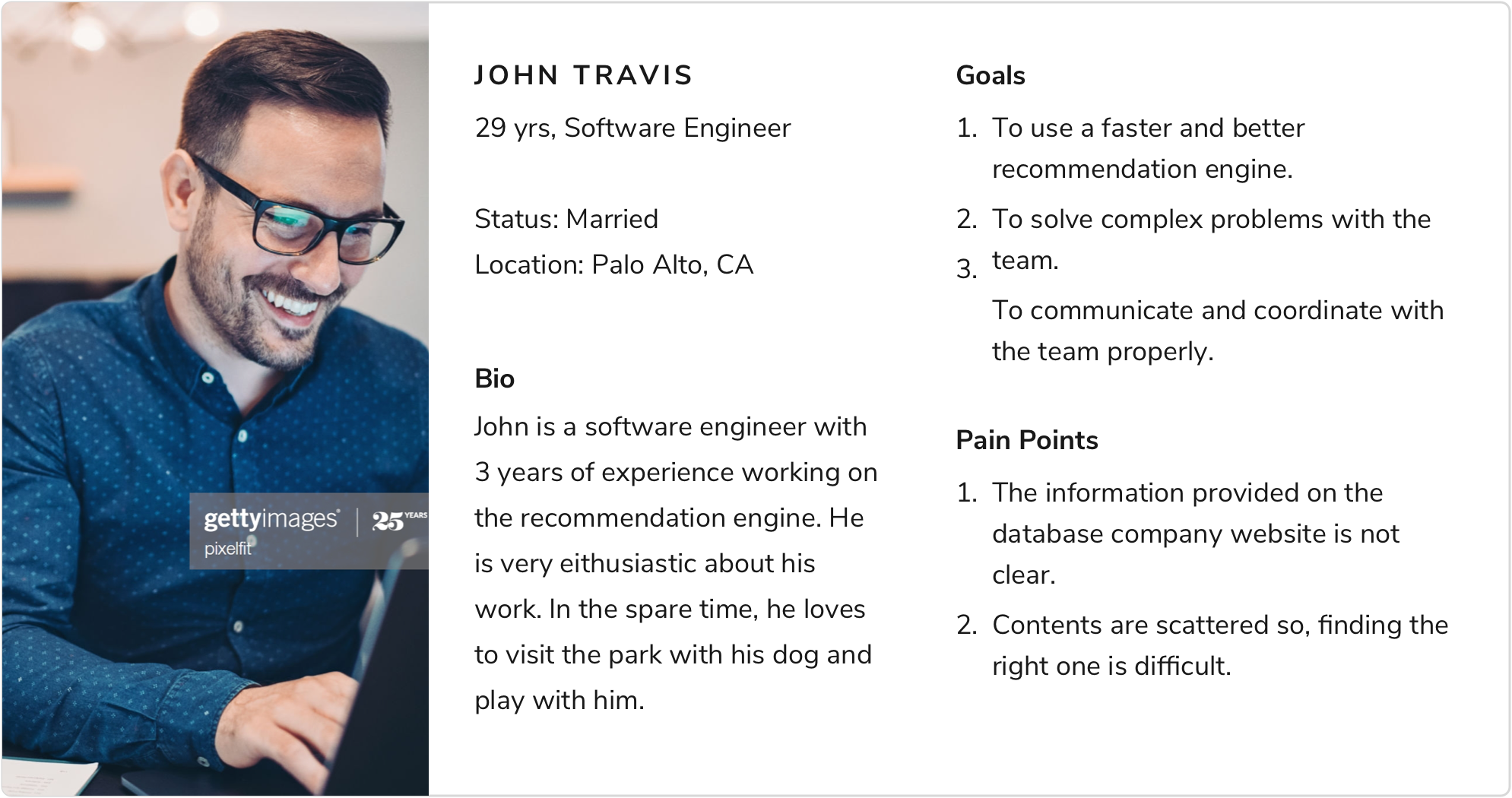
The scenario provided: “ John works at a e-commerce company in Palo Alto. He is a senior software engineer working on the recommendation engine. As their customer base is growing, there is a need for a faster and better recommendation engine. His manager has tasked him to look for some potential technologies that they might be able to use to achieve this goal.”
To understand the thoughts from a real user, I interviewed a Software Engineer. He works at Indianapolis, and is a Computer Science Graduate from 2018. Given below are some of the highlights from our conversation:
"I visit a product website only because I know about it or I have heard it from someone I know.
For something like Ne04j, not everyone happen to know about it. I will know it because I need to use it or my colleage has recommended me to try it.
I directly like trying out products. So, I download it first, then look for tutorials or documents to get started.
I would want to know what Neo4j is. The first panel is not clear to me.
I think the news could be somewhere else. It could be cleaner."
I used the quantitative data from Crazyegg provided to me to find out the most clicked links.
Most clicked links according to heatmap and overlay: Download, Learn, Products, Try it now (sandbox), Developers.
Sections scrolled up to according to scrollmap: Less scroll after “What is Neo4j?” section.
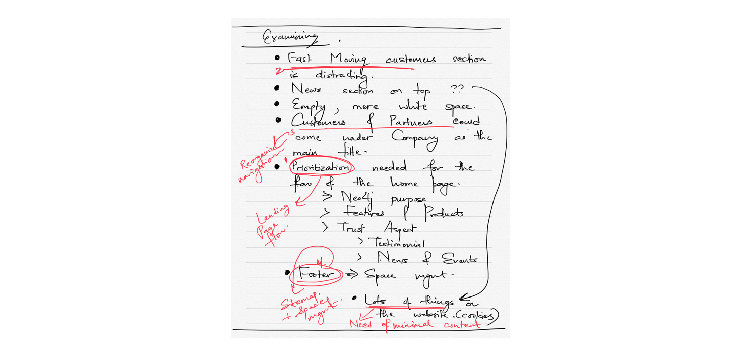
I conducted a competitive analysis of the current Neo4j website and other websites, MongoDB, Datastax, Amazon Neptune, Fauna DB. I focused on the important contents that needed to be displayed, the organization and prioritization of data, and the overall look and feel of the website.
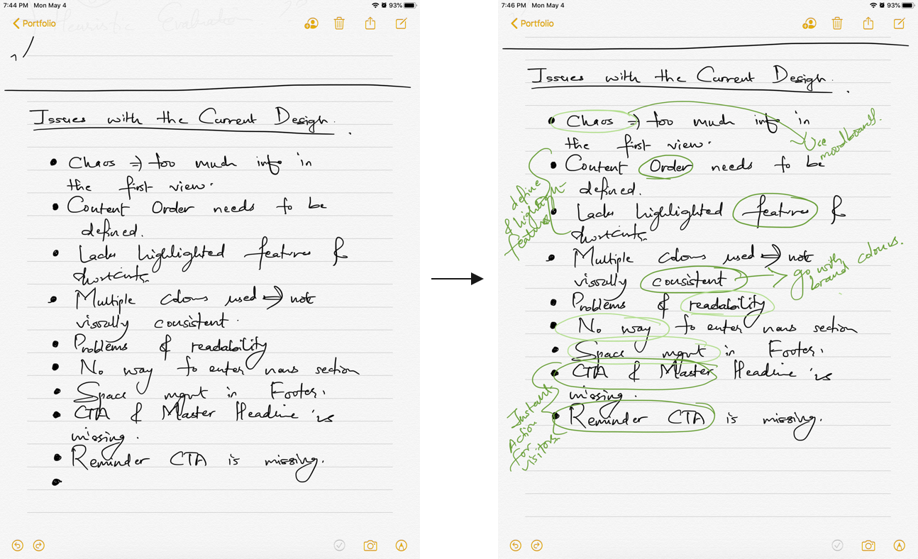
Next, I listed all the issues that I identified. I used Neilsen’s Heuristics to perform the heuristic evaluation. Then I highlighted the issues based on the severity. I used green color of different opacity: dark green for more severe and light green for least severe.
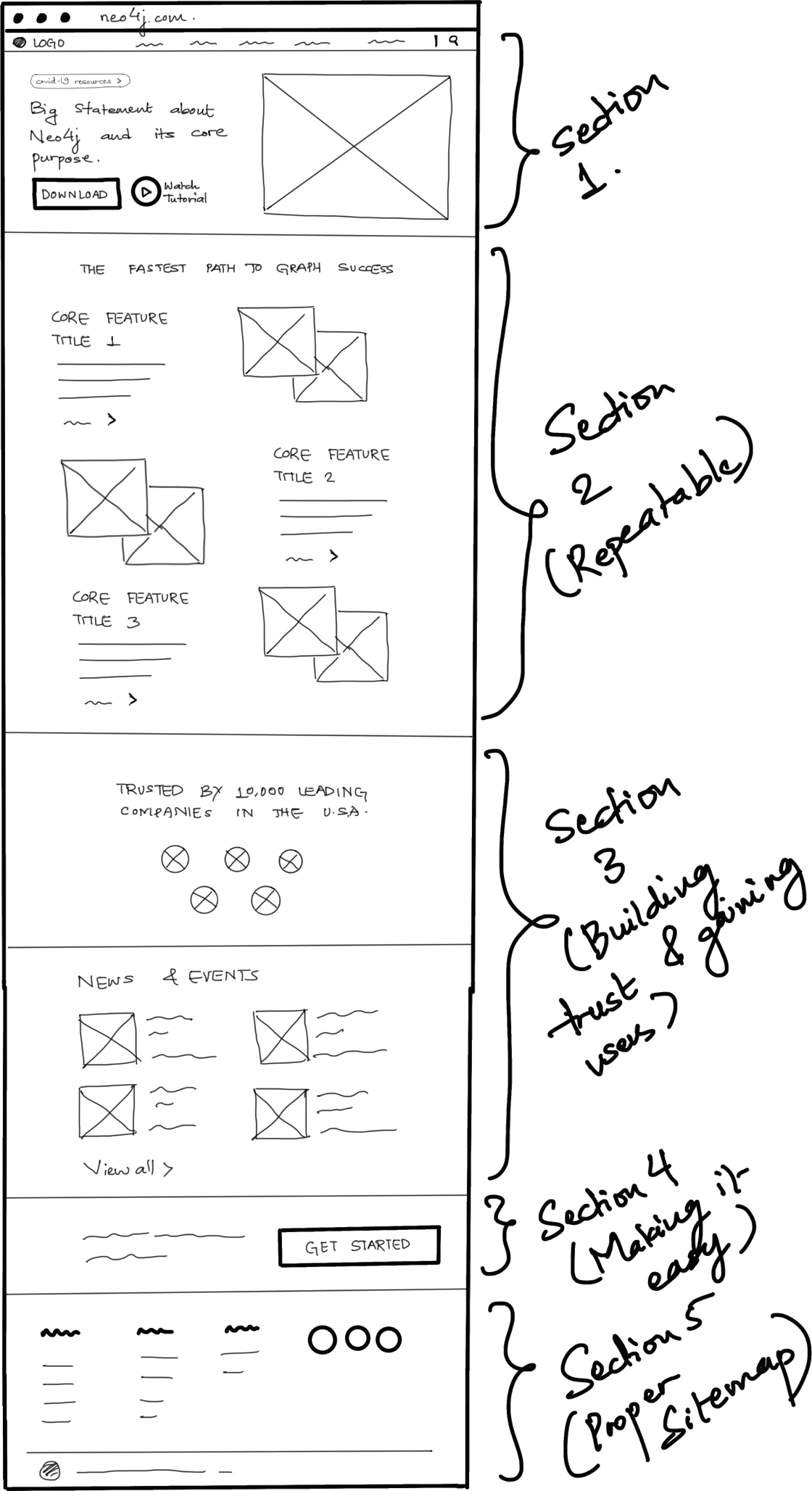
I opted for hand-drawn wireframe to begin so that its easier to edit and modify changes. After multiple scribblings, I came up with the following outlook. I used Procreate App on my ipad to create the wireframe. I will explain the approach I took for each section on the final design below.
I created moodboards, and defined the visual style.
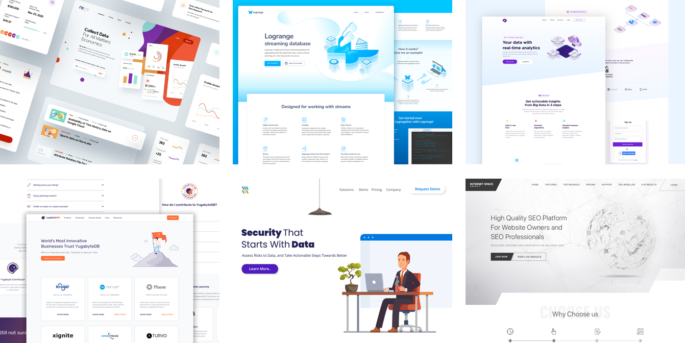
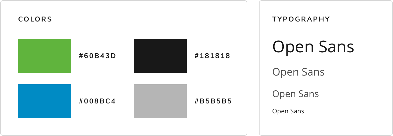
Disclaimer: These approaches and recommendations are based on my research findings, evaluation, and also my experience with redesigning a couple of company’s website in the past.
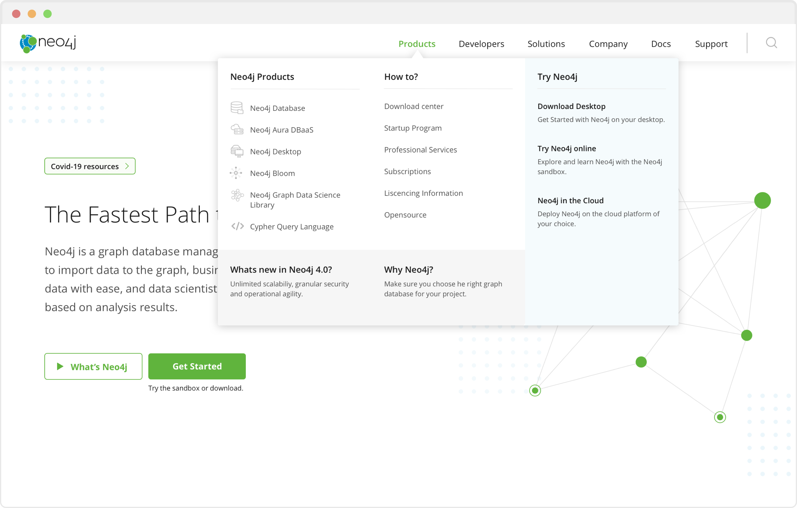
The first impression is the last impression. Let’s try not to overwhelm the developers by feeding too much information on one screen. Developers need a holistic overview about Neo4j. Also, no product website is complete without a Call-to-action button. Keeping into mind the current covid-19 situation, lets show what Neo4j can offer.
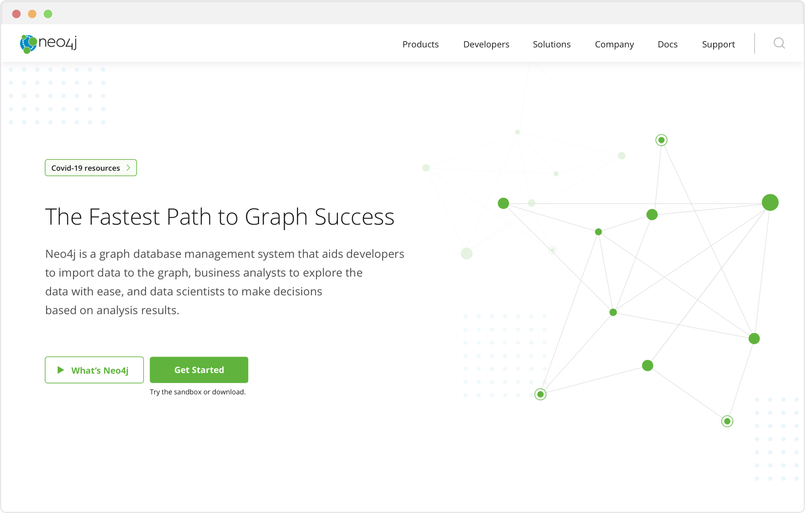
We try to keep contents clear and organized with the help of headings and subheadings. This way, we are also reducing the cognitive load of customers.
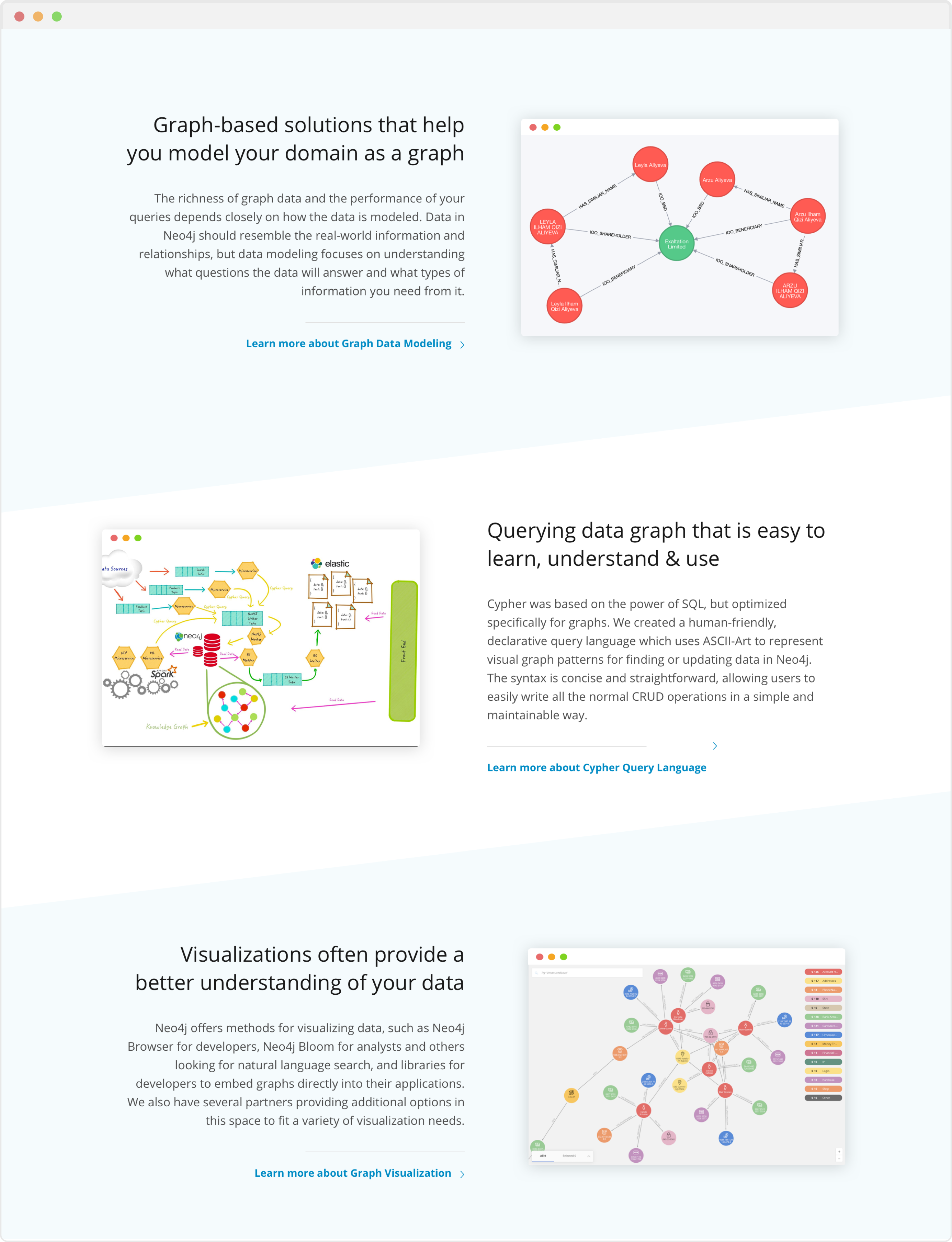
Now that our customers know the overview of Neo4j, lets give them an idea about our services and features. I have only created 3 sections for now but this section can be longer.
“Users don’t read, they scan!” Let’s make it easier for them by highlighting the core feature. But what if they want to learn more? We give them the option to view complete detail as well!
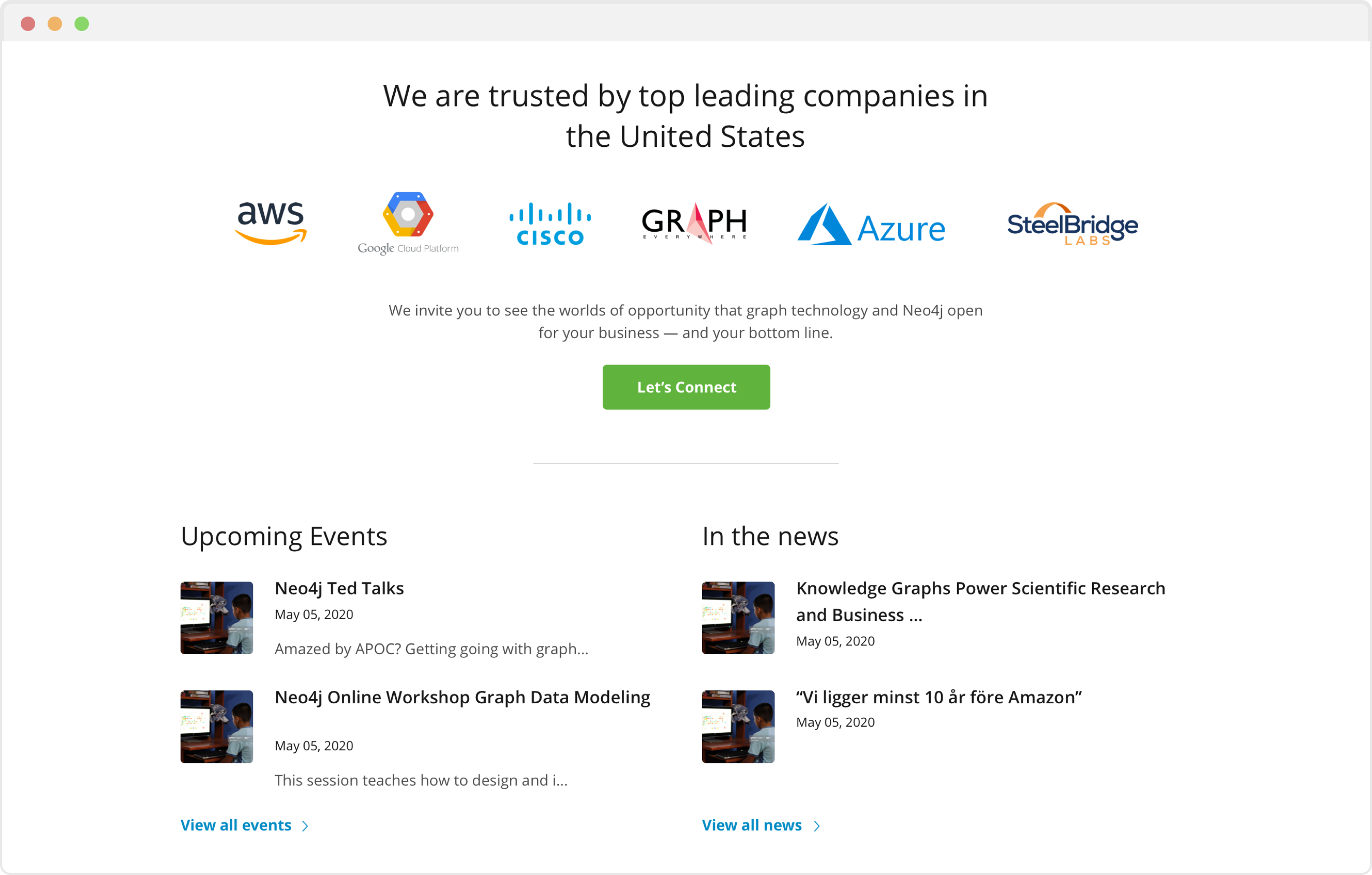
Now that our customers know us, lets win their trust …. by showing them our partners who have trusted us! Let’s help them connect with us immediately. Also, we will provide them ways to know us and get involved with us.
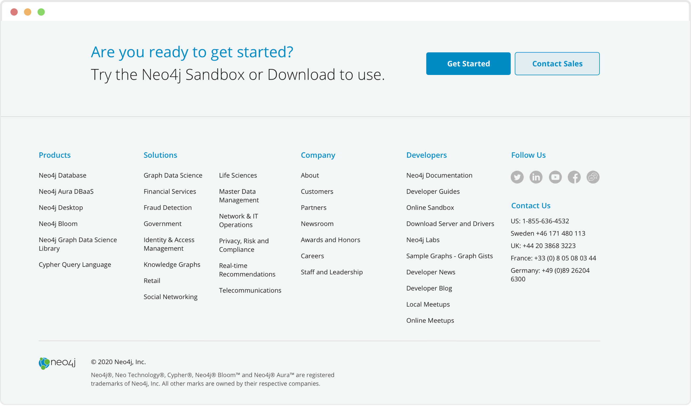
Let’s remind our customers that they are free to get started anytime they want. They don’t have to remember the spot in the home page, because we are here to remind them.
They want to know more?? We have a complete organized sitemap of entire website on our footer, along with social media presence, and contact details.
Please feel free to Test the Website mockup using the link provided below. I used Sketch and Invision to create it.
Test the website here.I learned how to organize and manage tasks in a limited amount of time.
If I had more time, I would love to conduct more interviews with the real users in order to understand their thoughts and expectations better.
Also, I would love to test the mockup website with a couple of developers to identify issues and gather feedbacks for the next iteration.