

Cigarette Addiction is a critical global problem. weQuit is a mobile application that provides a Social Platform, where people can collaborate and help each other quit smoking through Accountability Partnership, Professional Help, and be informed about their health status through periodic Medical Reports.
My Role:
User Research, Interaction, Visual Design, Prototyping & Testing
Duration:
8 weeks
Cigarette Addiction is a global issue. Among millions of people who die every year due to cigarette addiction, the majority are aware of the risks and health issues caused due to its consumption. Due to the habit developed by people to use smoking as a form of mental and physical relief, it has become difficult for them to quit smoking.

Create a platform to build a civic community where people support each other in their journey of quitting.

Build a community where public/social smoking is discouraged.

Make smokers aware of their individual health risks that they are susceptible to.
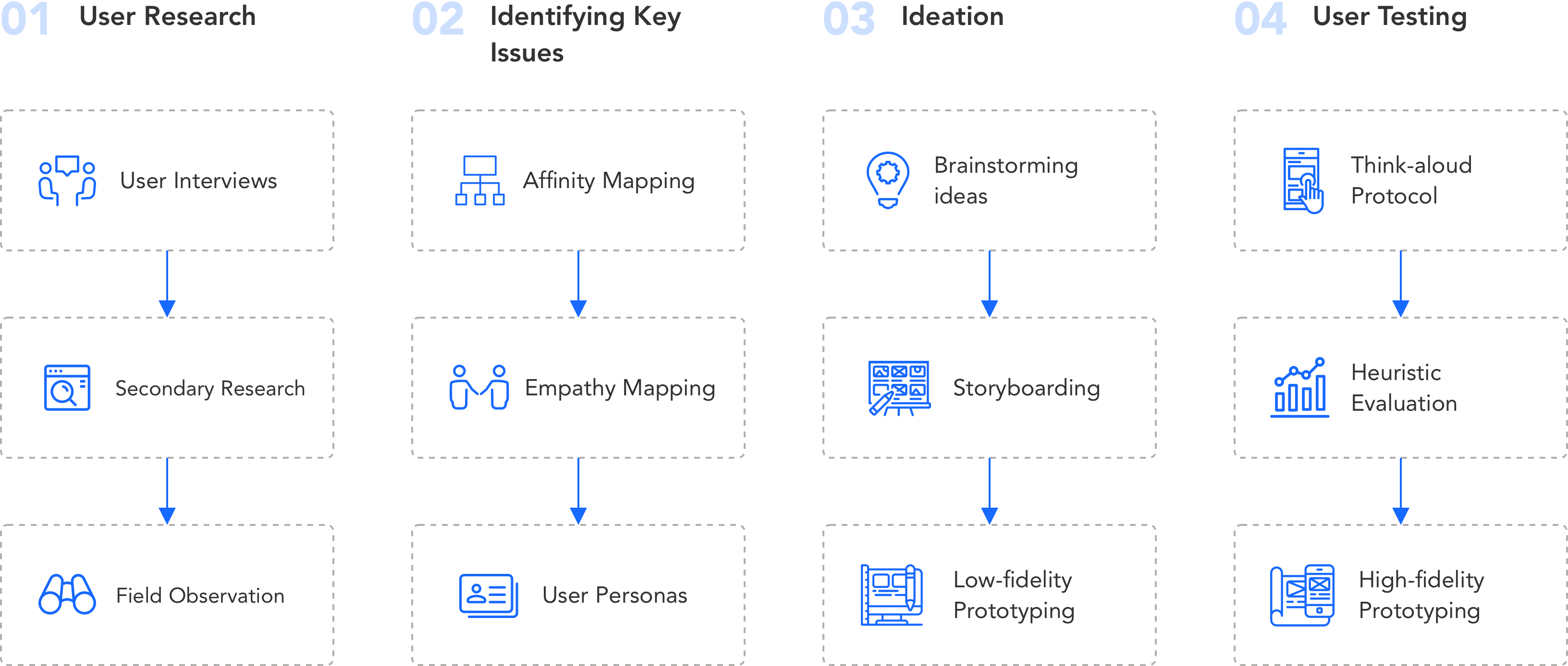
The purpose of the research was to observe the users in the natural environment to determine the pattern of their smoking. The goal of interviews was to understand the core problem faced by the users to design a better solution for them.
User Interview
We conducted semi-structured interviews with 7 participants of different age groups to understand the problem space. This helped us delve deeper into the reasons due to which people are facing difficulties quitting smoking.
Field Observation
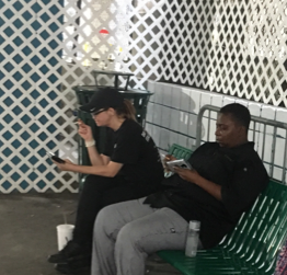
With the help of real-world observation, we were able to observe several instances, which portrayed passive smoking as a trigger for smokers to start smoking. We found that a bunch of people tend to smoke after their office hours.


Secondary Review

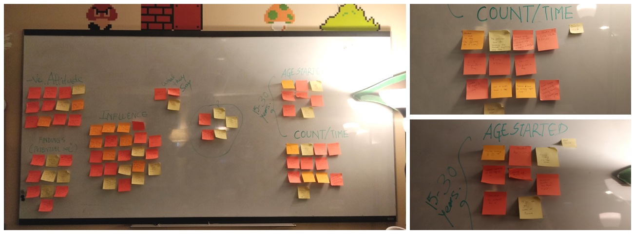
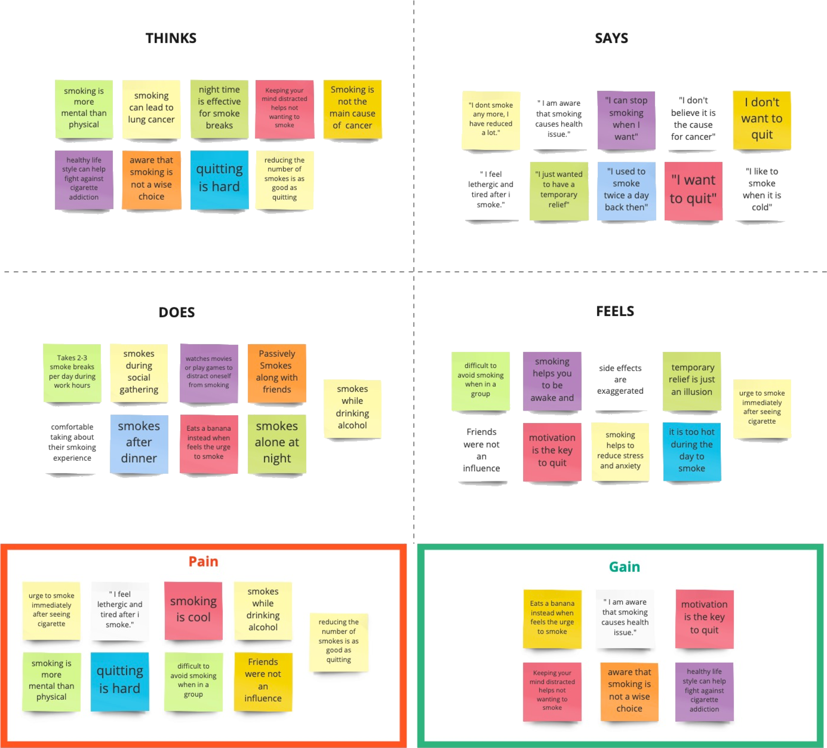
We used Affinity Diagram and Empathy Mapping to generate patterns from the information collected through interviews.
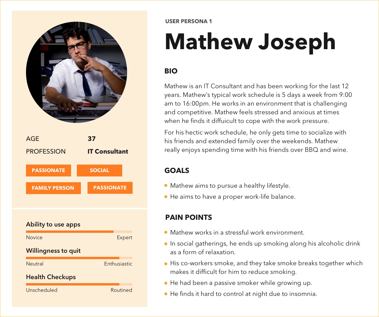
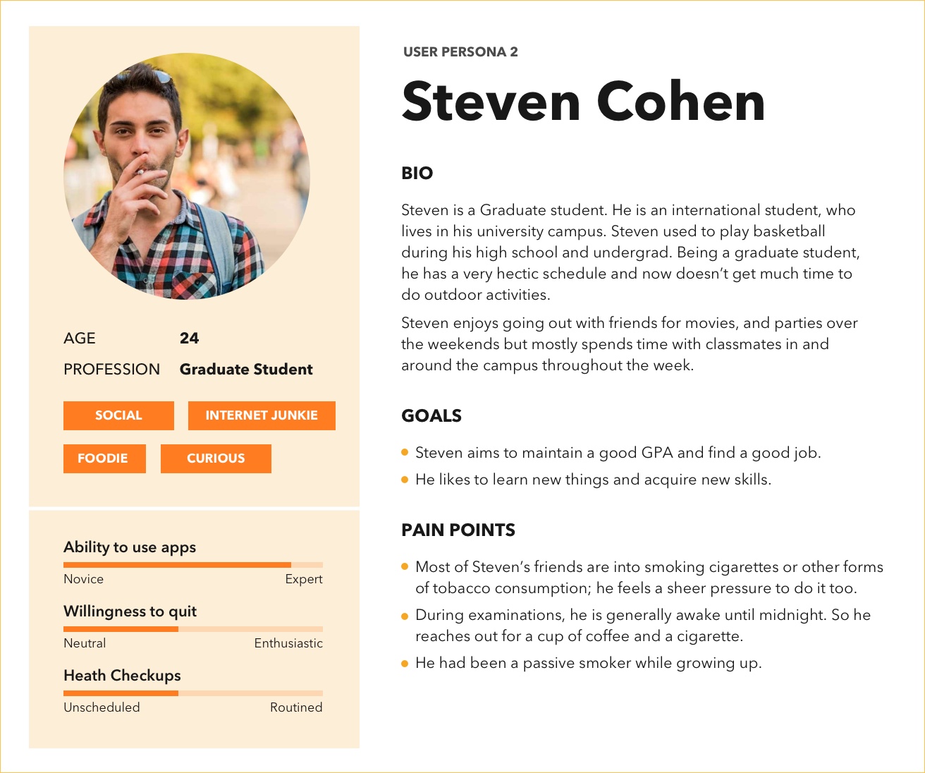
We conducted 4 sessions for brainstorming. We had gathered numerous ideas from our first session, but a lot of them were not technologically feasible. The Brainstorming Session 2 exposed us to ideas from other people outside our group, which broadened our perspective on different ways we can approach the solution. The Brainstorming Session 3 was most productive, we had more consolidated ideas, most of which seemed structured and technologically feasible and qualified as stand-alone solutions. We derived the final three ideas on our third brainstorming session.
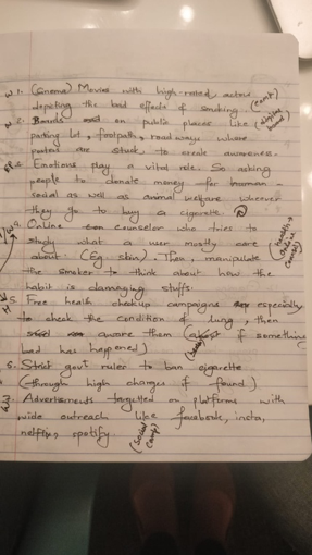
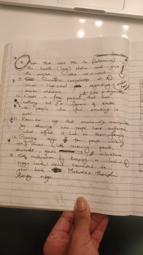
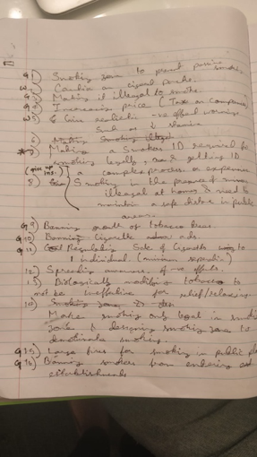

The app tracks smokings and cravings to generate insightful health reports based on user inputs.

The app allows to an add accountability partner to prevent each other from smoking by settings goals together.

The app generates periodic health report that provides users about their health stats to show their progress.

The app helps users who are seeking professional counseling to quit smoking.
With the help of features identified from brainstorming, I created the low fidelity designs. The tools I used was Invision Studio.
We conducted six think-aloud sessions to figure out possible usability issues so that we could revise and address that issue in the hi-fed prototype.
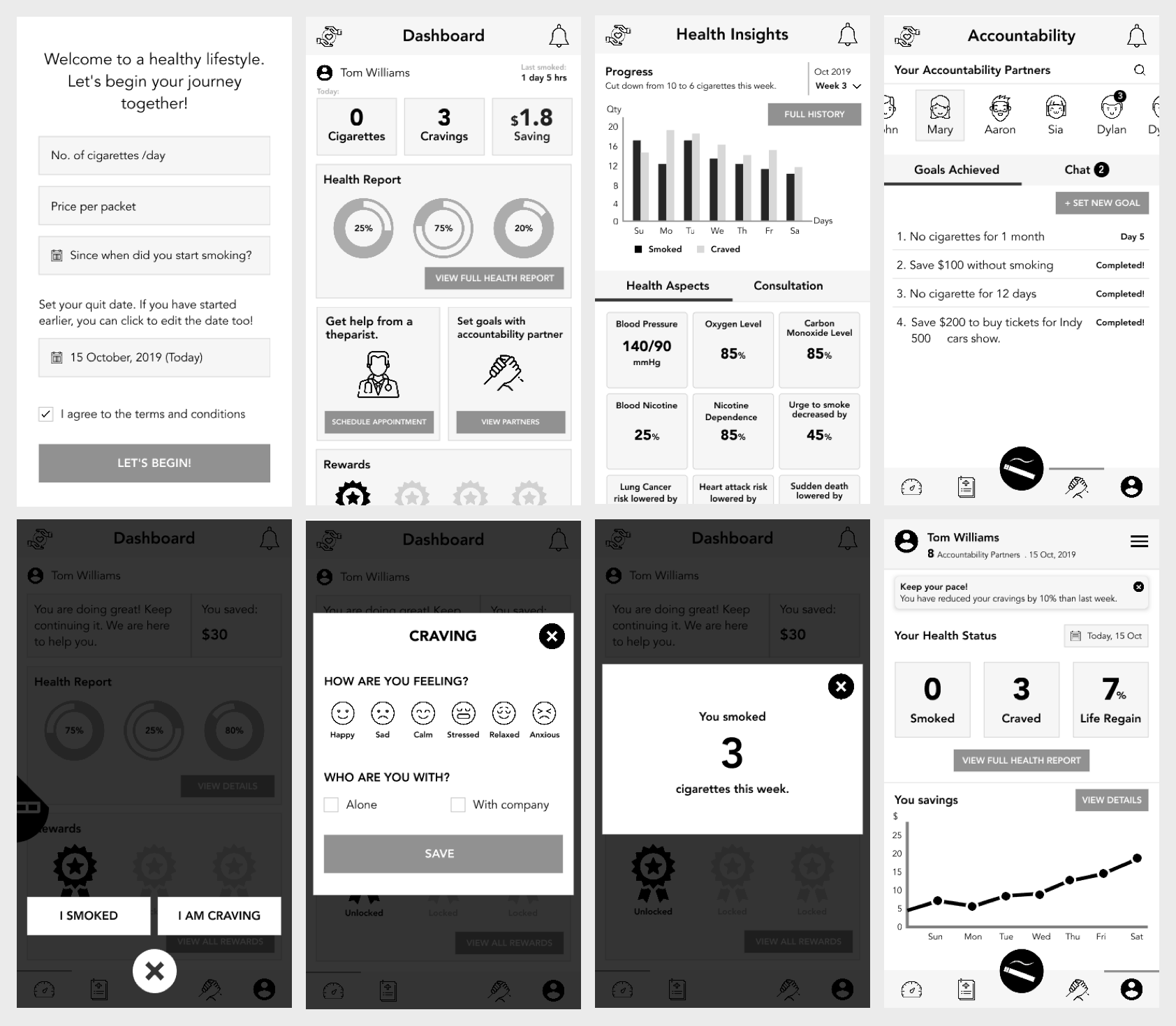
From the feedbacks collected from the think-aloud session, we revised our design and made additional changes to it to address the usability issues.
Since I had comparatively more experience and familiarity with the features of design tools, I single-handedly took the full responsibility of the high-fidelity prototyping. I used Sketch to create high-fed designs.
The metaphors for the visual design include: user-friendly, readable, positive, light, motivation.
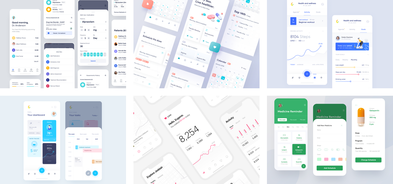
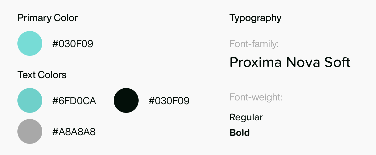
I used Sketch to create the high-fidelity designs and Illustrator to create icons.
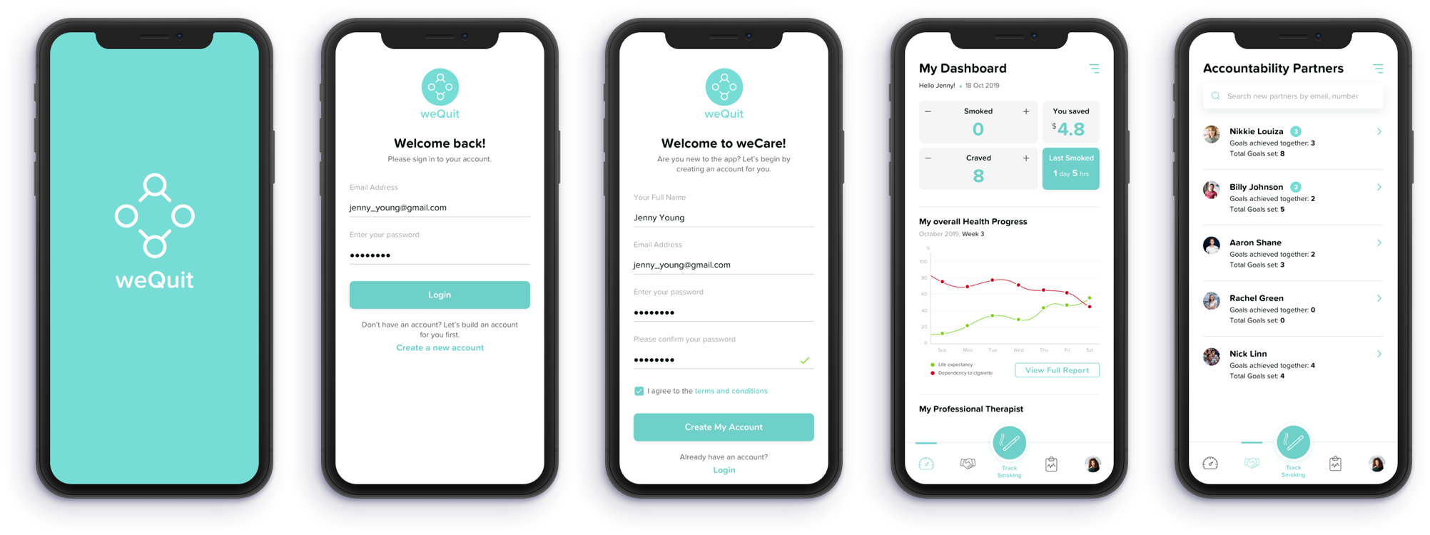
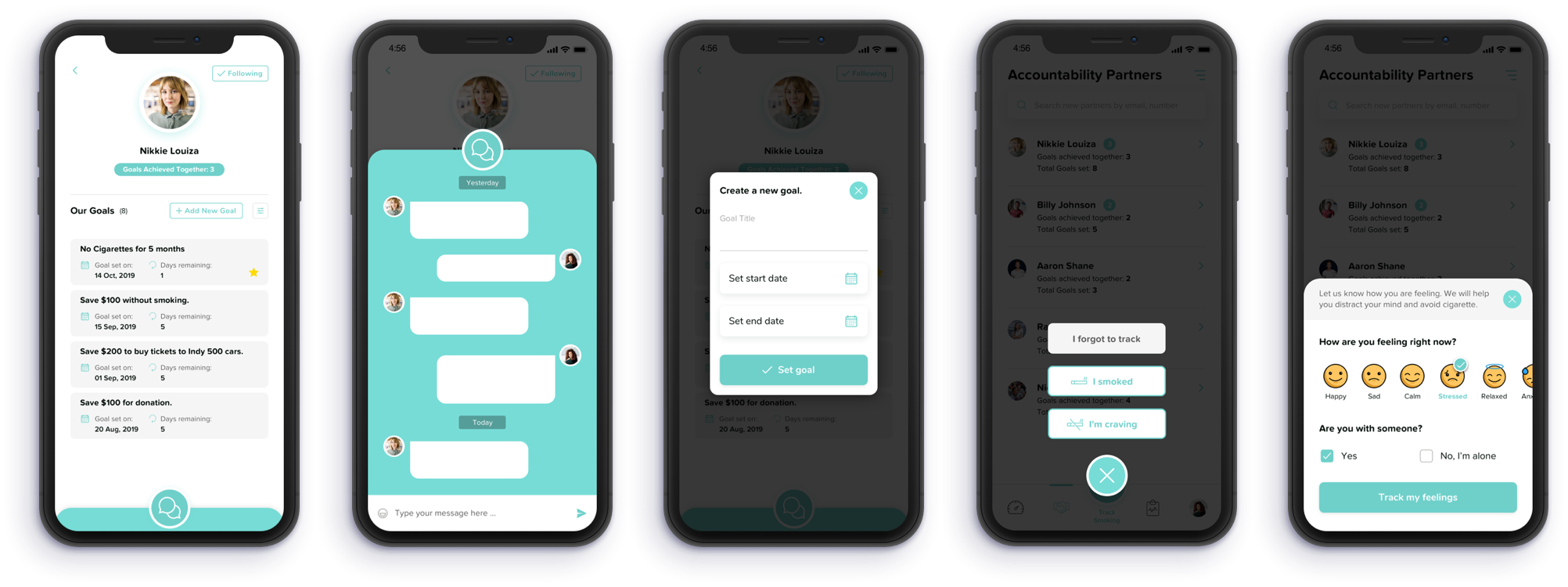
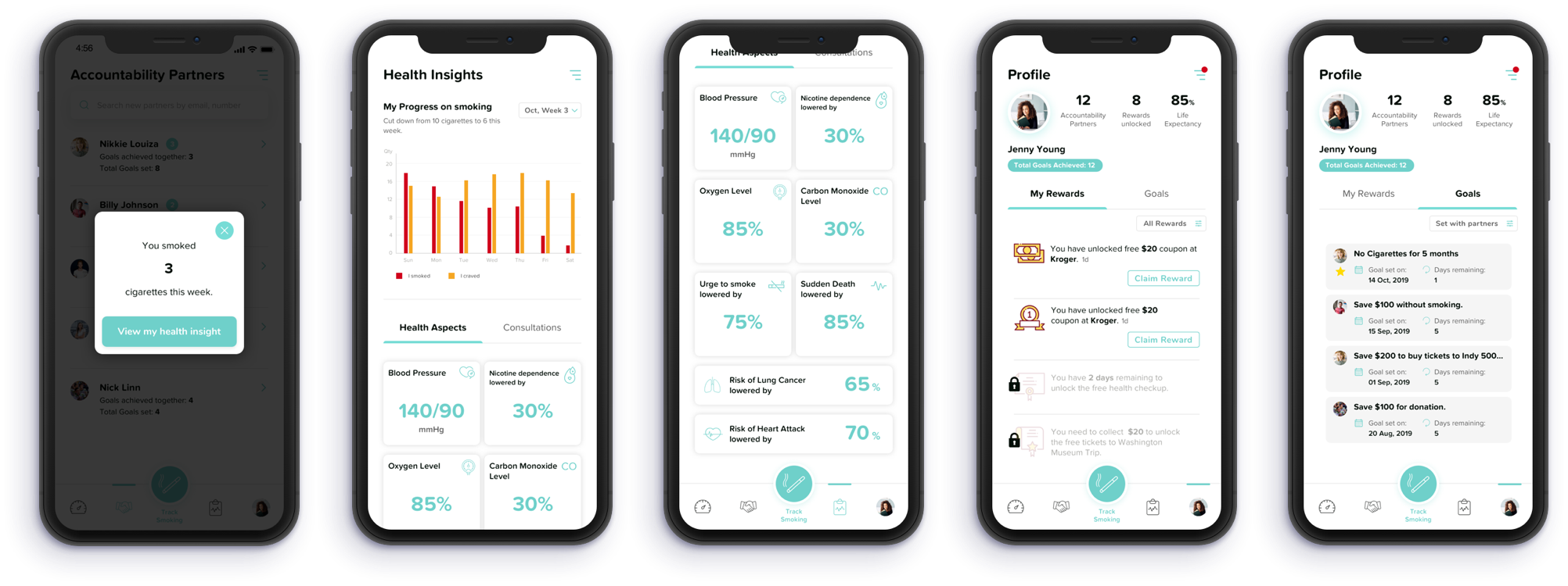
We conducted two think-aloud sessions for the high-fidelity designs followed by two evaluation methods: Heuristic Evaluation and Cognitive Walkthrough. The overall experience of the app was good to the users. However, there were few issues that we identified from the evaluations which are listed below:
The app prototype does not contain an onboarding page to introduce the core features of the app.
Users were confused by the arrow button, that is used to claim rewards, on the rewards section of the dashboard.
The star buttons used on the goal card is used to define which goal has a minimum time remaining to finish. However, users get confused if the star icons are used to add goals to favorite.
Our next steps would be to fix all the problems encountered during the evaluations and thinkaloud sessions. We would like to test the application with more users for feedbacks.